For the last several years I have published a set of team ratings that I call "Crude Team Ratings". The name was chosen to reflect the nature of the ratings--they have a number of limitations, of which I documented several when I introduced the methodology.
I explain how CTR is figured in the linked post, but in short:
1) Start with a win ratio figure for each team. It could be actual win ratio, or an estimated win ratio.
2) Figure the average win ratio of the team’s opponents.
3) Adjust for strength of schedule, resulting in a new set of ratings.
4) Begin the process again. Repeat until the ratings stabilize.
The resulting rating, CTR, is an adjusted win/loss ratio rescaled so that the majors’ arithmetic average is 100. The ratings can be used to directly estimate W% against a given opponent (without home field advantage for either side); a team with a CTR of 120 should win 60% of games against a team with a CTR of 80 (120/(120 + 80)).
First, CTR based on actual wins and losses. In the table, “aW%” is the winning percentage equivalent implied by the CTR and “SOS” is the measure of strength of schedule--the average CTR of a team’s opponents. The rank columns provide each team’s rank in CTR and SOS:

The top ten teams were the playoff participants, with the two pennant winners coming from the group of three teams that formed a clear first-tier. The #9 and #10 teams lost the wildcard games. Were it not for the identity of the one of those three that did not win the pennant, it would have been about as close to perfect a playoff outcome as I could hope for. What stood out the most among the playoff teams to me is that Arizona ranked slightly ahead of Washington. As we’ll see in a moment, the NL East was bad, and as the best team in the worst division, the Nationals had the lowest SOS in the majors, with their average opponent roughly equivalent to the A’s, while the Diamondbacks’ average opponent was roughly equivalent to the Royals.
Next are the division averages. Originally I gave the arithmetic average CTR for each divison, but that’s mathematically wrong--you can’t average ratios like that. Then I switched to geometric averages, but really what I should have done all along is just give the arithemetic average aW% for each division/league. aW% converts CTR back to an “equivalent” W-L record, such that the average across the major leagues will be .50000. I do this by taking CTR/(100 + CTR) for each team, then applying a small fudge factor to force the average to .500. In order to maintain some basis for comparison to prior years, I’ve provided the geometric average CTR alongside the arithmetric average aW%, and the equivalent CTR by solving for CTR in the equation:
aW% = CTR/(100 + CTR)*F, where F is the fudge factor (it was 1.0005 for 2017 lest you be concerned there is a massive behind-the-scenes adjustment taking place).

The league gap closed after expanding in 2016, but the AL maintained superiority, with only the NL West having a higher CTR than any AL division. It was a good bounceback for the NL West after being the worst division in 2016, especially when you consider that the team that had been second-best for several years wound up as the second-worst team in the majors. The NL East was bad, but not as bad as it was just two years ago.
I also figure CTRs based on various alternate W% estimates. The first is based Expected W%, (Pythagenpat based on actual runs scored and allowed):

The second is CTR based on Predicted W% (Pythagenpat based on runs created and allowed, actually Base Runs):

Usually I include a version based on Game Expected Winning %, but this year I’m finally switching to using the Enby distribution so it’s going to take a little bit more work, and I’d like to get one of these two posts up before the end of the year. So I will include the CTRs based on gEW% in the Run Distribution post.
A few seasons ago I started including a CTR version based on actual wins and losses, but including the postseason. I am not crazy about this set of ratings, the reasoning behind which I tried very poorly to explain last year. A shorter attempt follows: Baseball playoff series have different lengths depending on how the series go. This has a tendency to exaggerate the differences between the teams exhibited by the series, and thus have undue influence on the ratings. When the Dodgers sweep the Diamondbacks in the NLDS, this is certainly additional evidence that we did not previously have which suggests that the Dodgers are a stronger team than the Diamondbacks. But counting this as 3 wins to 0 losses exaggerates the evidence. I don’t mean this in the (equally true) sense that W% over a small sample size will tend to be more extreme than a W% estimate based on components (R/RA, RC/RCA, etc.) This we could easily account for by using EW% or PW%. What I’m getting at is that the number of games added to the sample is dependent on the outcomes of the games that are played. If series were played through in a non-farcical manner (i.e. ARI/LA goes five games regardless of the outcomes), than this would be a moot point.
I doubt that argument swayed even one person, so the ratings including playoff performance are:

With the Dodgers holding a 161 to 156 lead over the Astros before the playoffs, romping through the NL playoffs at 7-1 while the Astros went 7-4 in the AL playoffs, and taking the World Series to seven games, they actually managed to increase their position as the #1 ranked team. I’m not sure I’ve seen that before--certainly it is common for the World Series winner to not be ranked #1, but usually they get closer to it than further away.
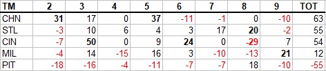
And the differences between ratings include playoffs (pCTR) and regular season only (rCTR):

Monday, December 18, 2017
Crude Team Ratings, 2017
Monday, December 11, 2017
Hitting by Position, 2017
Of all the annual repeat posts I write, this is the one which most interests me--I have always been fascinated by patterns of offensive production by fielding position, particularly trends over baseball history and cases in which teams have unusual distributions of offense by position. I also contend that offensive positional adjustments, when carefully crafted and appropriately applied, remain a viable and somewhat more objective competitor to the defensive positional adjustments often in use, although this post does not really address those broad philosophical questions.
The first obvious thing to look at is the positional totals for 2016, with the data coming from Baseball-Reference.com. "MLB” is the overall total for MLB, which is not the same as the sum of all the positions here, as pinch-hitters and runners are not included in those. “POS” is the MLB totals minus the pitcher totals, yielding the composite performance by non-pitchers. “PADJ” is the position adjustment, which is the position RG divided by the overall major league average (this is a departure from past posts; I’ll discuss this a little at the end). “LPADJ” is the long-term positional adjustment that I use, based on 2002-2011 data. The rows “79” and “3D” are the combined corner outfield and 1B/DH totals, respectively:

After their record-smashing performance in 2016, second basemen regressed to the mean, although they still outproduced the league average. The mid-defensive spectrum positions, third base and centerfield, were both similarly about 3% above their historical norms, but the real story of 2017 positional offense was DH. DHs were essentially as productive as shortstops. Looking at the two positions’ respective slash lines, DH had the better secondary average, SS the better batting average for the same run output. While DH has been down in recent years, they were at a much more respectable 109 last year. One year of this data tends to yield more blips than trends, although after a league average performance in 2016 left fielders only improved slightly to 102.
Moving on to looking at more granular levels of performance, I always start by looking at the NL pitching staffs and their RAA. I need to stress that the runs created method I’m using here does not take into account sacrifices, which usually is not a big deal but can be significant for pitchers. Note that all team figures from this point forward in the post are park-adjusted. The RAA figures for each position are baselined against the overall major league average RG for the position, except for left field and right field which are pooled.

While positions relative to the league bounce around each year, it seems that the most predictable thing about this post is that the difference between the best and worst NL pitching staffs will be about twenty runs at the plate. As a whole, pitchers were at 0.00 runs created/game, which is the first time I’ve estimated them at 0, although they dipped into the negative in 2014 then crept back into positive territory for two years.
I don’t run a full chart of the leading positions since you will very easily be able to go down the list and identify the individual primarily responsible for the team’s performance and you won’t be shocked by any of them, but the teams with the highest RAA at each spot were:
C--CHN, 1B--CIN, 2B--HOU, 3B--CHN, SS--HOU, LF--NYN, CF--LAA, RF--MIA, DH—SEA
More interesting are the worst performing positions; the player listed is the one who started the most games at that position for the team:

Usually this list is more funny than sad, but almost every player that led one of these teams in starts was at one time considered (by some, maybe, in the case of Alcides Escobar) to be an outstanding player. Mercifully Mark Trumbo led Oriole DHs to a worse composite performance than the Angels or it would have been a veritable tragedy. Although the depressing nature of this list is offset significantly by the presence of the Kansas City shortstops and their Esky Magic, it is also not fair to Eduardo Nunez, who hit fine as a SF 3B (764 OPS in 199 PA). The real culprits for the Giants were, well, everyone else who played third base, with a max 622 OPS out of Christian Arroyo, Pablo Sandoval, Kelby Tomlinson, Jae-gyun Hwan, Connor Gillaspie, Ryder Jones, Aaron Hill, and Orlando Calixte. Giant third basemen other than Nunez hit a combined un-park adjusted 174/220/246. Props to Austin Slater who had a single in his only PA as Giant third basemen, joining Nunez as the only non-horrible performer of the bunch.
I like to attempt to measure each team’s offensive profile by position relative to a typical profile. I’ve found it frustrating as a fan when my team’s offensive production has come disproportionately from “defensive” positions rather than offensive positions (“Why can’t we just find a corner outfielder who can hit?”) The best way I’ve yet been able to come up with to measure this is to look at the correlation between RG at each position and the long-term positional adjustment. A positive correlation indicates a “traditional” distribution of offense by position--more production from the positions on the right side of the defensive spectrum. (To calculate this, I use the long-term positional adjustments that pool 1B/DH as well as LF/RF, and because of the DH I split it out by league.) There is no value judgment here--runs are runs whether they are created by first basemen or shortstops:

The two teams with the most extreme correlations did so because of excellence (which we’ll see further evidence of in the next set of charts) from either a position group that is expected to provide offense (Miami’s outfielders) or from one that is not (Houston’s middle infielders). The signing of Edwin Encarnacion helped the Indians record a high correlation, as the rest of the positions didn’t strongly match expectations and the middle infielders hit very well.
The following tables, broken out by division, display RAA for each position, with teams sorted by the sum of positional RAA. Positions with negative RAA are in red, and positions that are +/-20 RAA are bolded:

In 2016, the Yankees were last in the division in RAA; this year they were the only above-average offense, led by the AL’s most productive outfield. The Red Sox nearly did the opposite, going from the best offense in the AL to a lot of red, highlighted by the AL’s worst corner infield production. They were the only AL team to have just one above average positon. To what extent the Blue Jays hit, it was from the right side of the defensive spectrum; their catchers and middle infielders were the worst in MLB.

The Indians had very balanced offensive contributions relative to position, with the +36 for DH inflated by the fact that here DH are compared to the (historically-low) 2017 positional average rather than a longer-term benchmark. Seeing the Detroit first basemen at -20 is sad. Kansas City had the worst outfield in the AL, as it seems it takes more than Esky Magic and “timely hitting” and “putting the ball in play” (yes, I realize their frequency of doing the latter has tailed off) to score runs.

Houston led all of MLB in infield and middle infield RAA, and they were the only AL team to have just one below average position. Los Angeles had the worst infield in MLB, and shortstop was the only position that chipped in to help Mike Trout.

Miami led MLB in outfield RAA; of course Giancarlo Stanton was the driving force but all three spots were outstanding. Washington had the NL’s top infield, Philadelphia the worst. But what jumped out at me in the NL East was how good Atlanta’s catchers were. Only the Cubs had a higher RAA. Atlanta’s unlikely duo was Tyler Flowers (282/382/447 in 368 PA overall) and Kurt Suzuki (284/355/539 in 306 PA). I have to admit I watch a lot of Braves games this year, so I am floored to see that Suzuki pulled a .255 ISO out of a hat; non-park adjusted, it was his career high by 94 points, and the .160 came a full decade ago.
The Cubs had two positions that led the majors in RAA, a good showing from first base--and otherwise a lot of average and below average. Cincinnati led the majors in RAA from corner infielders; Joey Votto is obvious, but Eugenio Suarez led the third basemen to a fine showing as well. Pittsburgh was the only NL team to have just one position show up in black font, but there’s a reason I’m not constructing that to say anything about “below average”...

The Dodgers joined the Nationals as the only NL teams to have just one below-average position and led the NL in middle infield RAA. Arizona and San Diego tied for the worst middle infield RAA in the NL, while the Giants had the worst corner infielders and outfielders in the majors. The remarkably bad third basemen, the single worst position in the majors, were discussed in greater detail above. But the Padres might have the most dubious distinction on this list; they had not a single position that was above average. It doesn’t stand out here because I zero is displayed in black font rather than red, and to be fair they had two positions at zero, as well as single positions at -1, -2, and -4; it’s not as if every position was making outs with no redeeming value. And their pitchers were +9, so they can hang their hat on that.
The full spreadsheet with data is available here.
Tuesday, November 28, 2017
Leadoff Hitters, 2017
I will try to make this as clear as possible: the statistics are based on the players that hit in the #1 slot in the batting order, whether they were actually leading off an inning or not. It includes the performance of all players who batted in that spot, including substitutes like pinch-hitters.
Listed in parentheses after a team are all players that started in twenty or more games in the leadoff slot--while you may see a listing like "COL (Blackmon)" this does not mean that the statistic is only based solely on Blackmon's performance; it is the total of all Colorado batters in the #1 spot, of which Blackmon was the only one to start in that spot in twenty or more games. I will list the top and bottom three teams in each category (plus the top/bottom team from each league if they don't make the ML top/bottom three); complete data is available in a spreadsheet linked at the end of the article. There are also no park factors applied anywhere in this article.
That's as clear as I can make it, and I hope it will suffice. I always feel obligated to point out that as a sabermetrician, I think that the importance of the batting order is often overstated, and that the best leadoff hitters would generally be the best cleanup hitters, the best #9 hitters, etc. However, since the leadoff spot gets a lot of attention, and teams pay particular attention to the spot, it is instructive to look at how each team fared there.
The conventional wisdom is that the primary job of the leadoff hitter is to get on base, and most simply, score runs. It should go without saying on this blog that runs scored are heavily dependent on the performance of one’s teammates, but when writing on the internet it’s usually best to assume nothing. So let's start by looking at runs scored per 25.5 outs (AB - H + CS):
1. COL (Blackmon), 7.9
2. HOU (Springer), 7.0
3. STL (Carpenter/Fowler), 6.7
Leadoff average, 5.5
ML average, 4.6
28. CHA (Garcia/Anderson/Sanchez), 4.4
29. KC (Merrifield/Escobar), 4.3
30. SD (Margot/Pirela), 3.9
That’s Leury Garcia for the White Sox, in case you were wondering. One of my favorite little tidbits from the 2017 season was their all-Garcia outfield: Willy, Leury, and Avasail. Sadly, one of my favorite tidbits from the last few season was no more as Kansas City finally decided that Esky Magic had run its course. Alcides Escobar only got 25 starts leading off, with Whit Merrifield leading the way with 115. The Royals still made plenty of appearances in the trailer portions of these lists.
The most basic team independent category that we could look at is OBA (figured as (H + W + HB)/(AB + W + HB)):
1. COL (Blackmon), .399
2. STL (Carpenter/Fowler), .374
3. HOU (Springer), .374
Leadoff average, .333
ML average, .327
28. CIN (Hamilton), .295
29. TOR (Pillar/Bautista), .287
30. KC (Merrifield/Escobar), .282
Even if we were to park-adjust Colorado’s .399, they’d be at .370, so it was a fine performance by Blackmon and company (mostly Blackmon, with 156 starts), but not the best in the league. There’s no good reason I don’t park-adjust, although my excuse is that park adjustments don’t apply (or at least can’t be based off the runs park factor) for some of the metrics presented here. Of the categories mentioned in this post, R/G, OBA, 2OPS, RG, and LE could be if one was so inclined.
The next statistic is what I call Runners On Base Average. The genesis for ROBA is the A factor of Base Runs. It measures the number of times a batter reaches base per PA--excluding homers, since a batter that hits a home run never actually runs the bases. It also subtracts caught stealing here because the BsR version I often use does as well, but BsR versions based on initial baserunners rather than final baserunners do not. Here ROBA = (H + W + HB - HR - CS)/(AB + W + HB).
This metric has caused some confusion, so I’ll expound. ROBA, like several other methods that follow, is not really a quality metric, it is a descriptive metric. A high ROBA is a good thing, but it's not necessarily better than a slightly lower ROBA plus a higher home run rate (which would produce a higher OBA and more runs). Listing ROBA is not in any way, shape or form a statement that hitting home runs is bad for a leadoff hitter. It is simply a recognition of the fact that a batter that hits a home run is not a baserunner. Base Runs is an excellent model of offense and ROBA is one of its components, and thus it holds some interest in describing how a team scored its runs. As such it is more a measure of shape than of quality:
1. STL (Carpenter/Fowler), .341
2. COL (Blackmon), .336
3. PHI (Hernandez), .327
5. SEA (Segura/Gamel), .319
Leadoff average, .295
ML average, .288
28. CIN (Hamilton), .265
29. KC (Merrifield/Escobar), .248
30. TOR (Pillar/Bautista), .241
With the exception of Houston, the top and bottom three are the same as the OBA list, just in different order (HOU was eighth at .313, their 38 homers out of the leadoff spot tied with Colorado; Minnesota, the Mets, Cleveland, and Tampa Bay also got 30 homers out of the top spot).
I also include what I've called Literal OBA--this is just ROBA with HR subtracted from the denominator so that a homer does not lower LOBA, it simply has no effect. It “literally” (not really, thanks to errors, out stretching, caught stealing after subsequent plate appearances, etc.) is the proportion of plate appearances in which the batter becomes a baserunner able to be advanced by his teammates. You don't really need ROBA and LOBA (or either, for that matter), but this might save some poor message board out there twenty posts, by not implying that I think home runs are bad. LOBA = (H + W + HB - HR - CS)/(AB + W + HB - HR):
1. COL (Blackmon), .354
2. STL (Carpenter/Fowler), .352
3. PHI (Hernandez), .332
4. HOU (Springer), .330
Leadoff average, .303
ML average, .298
28. CIN (Hamilton), .268
29. KC (Merrifield/Escobar), .253
30. TOR (Pillar/Bautista), .251
The next two categories are most definitely categories of shape, not value. The first is the ratio of runs scored to RBI. Leadoff hitters as a group score many more runs than they drive in, partly due to their skills and partly due to lineup dynamics. Those with low ratios don’t fit the traditional leadoff profile as closely as those with high ratios (at least in the way their seasons played out, and of course using R and RBI incorporates the quality and style of the hitters in the adjacent lineup spots rather then attributes of the leadoff hitters’ performance in isolation):
1. MIA (Gordon), 2.5
2. TEX (DeShields/Choo/Gomez), 2.2
3. CIN (Hamilton), 2.2
Leadoff average, 1.5
ML average, 1.0
27. SD (Margot/Pirela), 1.3
28. KC (Merrifield/Escobar), 1.2
29. MIN (Dozier), 1.1
30. CLE (Kipnis/Lindor/Santana), 1.1
Cleveland only settled on a permanent leadoff fixture (Lindor) late in the season, but all three of their 20+ game leadoff men were of the same general type. They didn’t really have a player who saw regular time who fit anything like the leadoff profile. It worked OK; their .328 OBA was lower than the leadoff average, but as we’ll see later their 5.2 RG was above average.
A similar gauge, but one that doesn't rely on the teammate-dependent R and RBI totals, is Bill James' Run Element Ratio. RER was described by James as the ratio between those things that were especially helpful at the beginning of an inning (walks and stolen bases) to those that were especially helpful at the end of an inning (extra bases). It is a ratio of "setup" events to "cleanup" events. Singles aren't included because they often function in both roles.
Of course, there are RBI walks and doubles are a great way to start an inning, but RER classifies events based on when they have the highest relative value, at least from a simple analysis:
1. CIN (Hamilton), 1.7
2. MIA (Gordon), 1.6
3. TEX (DeShields/Choo/Gomez), 1.3
Leadoff average, .8
ML average, .6
28. TB (Dickerson/Kiermaier/Smith/Souza), .5
29. BAL (Smith/Beckham/Jones/Rickard), .5
30. COL (Blackmon), .5
Both Tampa Bay and Baltimore followed the Cleveland pattern of using multiple leadoff hitters, although one of the four for each (Mallex Smith and Joey Rickard) fit more of a traditional profile. The Rays got 5.1 RG out of this hodgepodge, which is above-average; the Orioles’ 4.3 was not. For the record, I’m basing my assessment of Joey Rickard’s traditional leadoff style bona fides on his career minor league line (.280/.388/.392), and not his major league line (.255/.298/.361) for which the only stylistic interpretation is “bad”.
Since stealing bases is part of the traditional skill set for a leadoff hitter, I've included the ranking for what some analysts call net steals, SB - 2*CS. I'm not going to worry about the precise breakeven rate, which is probably closer to 75% than 67%, but is also variable based on situation. The ML and leadoff averages in this case are per team lineup slot:
1. WAS (Turner/Goodwin), 37
2. CIN (Hamilton), 36
3. MIA (Gordon), 25
4. NYA (Gardner), 21
Leadoff average, 8
ML average, 2
28. CHN (Jay/Zobrist/Schwarber), -2
29. COL (Blackmon), -5
30. HOU (Springer), -7
A lot of the leaders and trailers are flipped on this list from the overall quality measures.
Shifting back to said quality measures, first up is one that David Smyth proposed when I first wrote this annual leadoff review. Since the optimal weight for OBA in a x*OBA + SLG metric is generally something like 1.7, David suggested figuring 2*OBA + SLG for leadoff hitters, as a way to give a little extra boost to OBA while not distorting things too much, or even suffering an accuracy decline from standard OPS. Since this is a unitless measure anyway, I multiply it by .7 to approximate the standard OPS scale and call it 2OPS:
1. COL (Blackmon), 979
2. HOU (Springer), 887
3. MIN (Dozier), 865
Leadoff average, 763
ML average, 755
28. TOR (Pillar/Bautista), 678
29. KC (Merrifield/Escobar), 658
30. CIN (Hamilton), 651
Along the same lines, one can also evaluate leadoff hitters in the same way I'd go about evaluating any hitter, and just use Runs Created per Game with standard weights (this will include SB and CS, which are ignored by 2OPS):
1. COL (Blackmon), 7.8
2. HOU (Springer), 6.4
3. MIN (Dozier), 6.1
Leadoff average, 4.8
ML average, 4.6
28. TOR (Pillar/Bautista), 3.7
29. CIN (Hamilton), 3.6
30. KC (Merrifield/Escobar), 3.5
Allow me to close with a crude theoretical measure of linear weights supposing that the player always led off an inning (that is, batted in the bases empty, no outs state). There are weights out there (see The Book) for the leadoff slot in its average situation, but this variation is much easier to calculate (although also based on a silly and impossible premise).
The weights I used were based on the 2010 run expectancy table from Baseball Prospectus. Ideally I would have used multiple seasons but this is a seat-of-the-pants metric. The 2010 post goes into the detail of how this measure is figured; this year, I’ll just tell you that the out coefficient was -.230, the CS coefficient was -.597, and for other details refer you to that post. I then restate it per the number of PA for an average leadoff spot (750 in 2017):
1. COL (Blackmon), 45
2. HOU (Springer), 26
3. MIN (Dozier), 25
Leadoff average, 2
ML average, 0
28. CIN (Hamilton), -17
29. TOR (Pillar/Bautista), -18
30. KC (Merrifield/Escobar), -24
Esky Magic has residual effects, apparently. I don’t recall seeing the same teams in the leaders and trailers list for 2OPS, RG, and LE before, but they are all very similar in terms of their construction, with 2OPS arbitrarily but logically tilted towards OBA and LE attempting to isolate run value that would be contributed if all plate appearances came in a leadoff situation. RG represents the approximate run value of a player’s performance in an “average” situation on an average team.
The spreadsheet with full data is available here.
Wednesday, November 15, 2017
Hypothetical Ballot: MVP
My heart’s just not in writing this, since it’s the first time in the brilliant career of Mike Trout that he will not top my AL MVP ballot. This is made a little better by noting that, prorated to 150 games, he contributed 90 RAR to my choice’s 76, but you add no value to your team when you’re sitting at home. I should note that there have been many less deserving MVP winners than Mike Trout would be in 2017.
Jose Altuve leads Aaron Judge by four RAR, not considering baserunning or fielding. Judge’s fielding metrics are better than one might expect from a man of his size--5 FRAA, 6 UZR, 9 DRS--but Altuve ranks as average, and per Fangraphs was worth another run on the basepaths, so I don’t think it’s enough to bump him. It’s well within any margin of error and Judge would certainly be a fine choice as MVP.
The other candidate for the top spot is Corey Kluber--with 81 RAR, he’d would my choice by default. But while Kluber’s RAR using his peripherals (78) and DIPS (71) are good, they are basically a match for Altuve’s 77 (after baserunning). Our analytical approach for evaluating hitters is much more like using pitcher’s peripherals than their actual runs allowed, and there should be some consideration that some of the value attributed to a pitcher is actually due to his fielders (if you’re not making an explicit adjustment for that). For me, if a pitcher doesn’t clearly rank ahead of a hitter, he doesn’t get the benefit of the doubt on a MVP ballot.
The rest of the ballot is pretty straightforward by RAR, mixing the top pitchers in, as the top-performing hitters were all solid in the field and didn’t change places:
1. 2B Jose Altuve, HOU
2. RF Aaron Judge, NYA
3. SP Corey Kluber, CLE
4. SP Chris Sale, BOS
5. CF Mike Trout, LAA
6. SP Carlos Carrasco, CLE
7. 3B Jose Ramirez, CLE
8. SP Luis Severino, NYA
9. SP Justin Verlander, DET/HOU
10. SS Carlos Correa, HOU
In the NL, Joey Votto has a two-run RAR lead over Giancarlo Stanton, but Fangraphs has him at a whopping -10 baserunning runs to Stanton’s -2. BP has the same margin, but -8 to 0. Their fielding numbers (FRAA, UZR, DRS) are almost identical--(10, 11, 7) for Votto and (9, 10, 7) for Stanton. I’m not sure I’ve ever determined the top spot on my ballot on the basis of baserunning value before, but even if you were to be extremely conservative and regress it by 50%, it makes the difference. Paul Goldschmidt will get a lot of consideration, but even as a good baserunner and fielder I don’t think his 52 RAR offensively gets him in the picture for the top of the ballot.
Max Scherzer’s case is similar to Kluber’s, except with an even more pronounced gap between his actual runs allowed-based RAR (77), his peripherals (71), and DIPS (61).
The rest of my ballot follows RAR, as there were no players who made a huge difference in the field. I might be more inclined to accept an argument that Buster Posey was more valuable than the statistics suggest in a season in which San Francisco didn’t have the second-worst record in the league. But one player is missing from my ballot who will be high on many (although not in the top three of the BBWAA vote) is Nolan Arenado, and I feel that deserves a little explanation.
Rather than comparing Arenado to every player on my ballot, let’s look at my last choice, Marcell Ozuna. Ozuna starts with a ten run lead in RAR (56 to 46). Arenado is widely regarded as an excellent fielder, but the metrics aren’t in agreement--1 FRAA, 7 UZR, 20 DRS. Ozuna’s figures are (5, 11, 3). If you believe that Arenado is +20 fielder, than he would rank about dead even with Kris Bryant at 66 RAR (bumping Bryant from 61 on the strength of his own (especially) baserunning and fielding). It’s certainly not out of the realm of possibility. But if you only give Arenado credit for 10 fielding runs, that only pulls him even with Ozuna, before giving Ozuna any credit for his fielding.
I was going to write a bit more about how it might be easy for writers to consider Coors Field but understate how good of a hitter’s park it is (116 PF). If you used 110 instead, then Arenado starts at 51. But given that he didn’t finish in the top three, I don’t think there’s any evidence of not taking park into account. As discussed, there are perfectly reasonable views on Arenado’s fielding value that justify fourth-place. I’m not sure Arenado would be 11th or 12th or 13th if I went further, as Tommy Pham, Corey Seager, Clayton Kershaw, Gio Gonzalez, and Zack Greinke are all worthy of consideration for the bottom of the ballot themselves:
1. RF Giancarlo Stanton, MIA
2. 1B Joey Votto, CIN
3. SP Max Scherzer, WAS
4. 3B Kris Bryant, CHN
5. CF Charlie Blackmon, COL
6. 3B Anthony Rendon, WAS
7. 1B Paul Goldschmidt, ARI
8. 3B Justin Turner, LA
9. SP Stephen Strasburg, WAS
10. LF Marcell Ozuna, MIA
Tuesday, November 14, 2017
Hypothetical Ballot: Cy Young
The starting pitchers (and they’re the only ones that can possibly accrue enough value to be serious Cy Young candidates if you subscribe to the school of thought that all innings are created equal and the only leveraging effect appropriate to credit to relief aces is that they are used in close games) did a very nice job of separating themselves by RAR into groups of five or six, with a five run gap to the next pitcher. This makes a very convenient cut point to define the ballot candidates:
AL: Kluber 81, Sale 71, Carrasco 62, Verlander 61, Severino 59, Santana 59, Stroman 52
NL: Scherzer 77, Gonzalez 66, Kershaw 64, Strasburg 62, Greinke 57, Ray 51
Corey Kuber has a clear edge over Chris Sale in RAR, but it’s closer (78 to 73) in RAR based on eRA, and in RAR based on DIPS theory (assuming an average rate of hits on balls in play), Sale flips the standard list almost perfectly (80 to 71). My philosophy has always been that the actual runs allowed takes precedence, and while DIPS can serve to narrow the difference, Kluber is still outstanding when viewed in that light (e.g. this is not a Joe Mays or Esteban Loaiza situation). I don’t think it comes close to making up the difference. FWIW, Baseball Prospects WARP, which attempts to account for all matter of situational effects not captured in the conventional statistical record, sees Kluber’s performance as slightly more valuable (8.0 to 7.6).
The rest of my AL ballot goes in order except to flip Severino and Verlander. Severino had significantly better marks in both eRA (3.15 to 3.73) and dRA (3.40 to 4.12). Santana had an even more marked disparity between his actual runs allowed and the component measures (3.82 eRA, 4.75 dRA) which also triggers confirmation bias as he and Jason Vargas’ first-half performances were quite vexing to this Cleveland fan.
1. Corey Kluber, CLE
2. Chris Sale, BOS
3. Carlos Carrasco, CLE
4. Luis Severino, NYA
5. Justin Verlander, DET/HOU
In the NL, I was a little surprised to see that in some circles, Clayton Kershaw is the choice for the award and may well win it. Tom Tango pointed out that Kershaw’s edges over Scherzer in both W-L (18-4 to 16-6) and ERA (2.31 to 2.51) give him a clear edge in the normal thought process of voters. I have been more detached than normal this season from the award debates as you might hear on MLB Tonight, and so seeing a 13 run gap in RAR I didn’t even consider that there might be a groundswell of support for Kershaw. With respect to ERA, Scherzer has a lower RRA (based on runs allowed, adjusting for park, and crudely accounting for bullpen support) and Kershaw’s raw .20 ERA lead drops to just .08 (2.41 to 2.49) when park-adjusting.
What’s more is that Scherzer has a larger edge over Kershaw in eRA (2.71 to 3.26) and dRA (3.20 to 3.73) than he does in RRA (2.56 to 2.72)--leading in all three with a 25 inning advantage. Scherzer led the NL in RRA and eRA, was a narrow second to his teammate Strasburg (3.07 to 3.20) in dRA, and was just seven innings off the league lead (albeit in seventh place). For Cy Young races in non-historic pitcher seasons, I don’t think it gets much more clear than this.
As a final note on Kershaw v. Scherzer, perhaps some of the pro-Kershaw sentiment goes beyond W-L and ERA and into the notion that Kershaw is the best pitcher in baseball. I don’t think this is relevant to a single season award, and I think it would have a much more obvious application to the AL MVP race, where not only is Mike Trout the best player in baseball, but the best by a tremendous margin, and was easily the most valuable player on a rate basis in the league (NOTE: I am not advocating that Trout should be the MVP, only that he has a better case using this argument than Kershaw). But it may be time to re-evaluate Kershaw as the best pitcher in baseball as a fait accompli. Over the last three seasons, Scherzer has pitched 658 innings with a 2.84 RRA and 211 RAR; Kershaw has pitched 557 innings with a 2.37 RRA and 206 RAR. At some point, the fact that Scherzer has consistently been more durable than Kershaw should factor into the discussion of “best”.
Strasburg placed second to Scherzer in eRA, and as discussed bettered him in dRA, recording one more out than Kershaw did. That’s enough for me to move him into second over teammate Gonzalez as well, who had an even larger peripheral gap than Kershaw (basing RAR on eRA, Strasburg beats Gonzalez 62 to 56; on dRA, 56 to 37), so I see it as:
1. Max Scherzer, WAS
2. Stephen Strasburg, WAS
3. Clayton Kershaw, LA
4. Gio Gonzalez, WAS
5. Zack Greinke, ARI
Monday, November 06, 2017
Hypothetical Ballot: Rookie of the Year
Let's assume for a moment that you care about post-season awards (I've lost at least 30% of you).
Then let's suppose you care about my opinion about how should win them (another 50% gone...I'd guess higher but you are reading this blog after all).
So for the 20% of you left (those percentages were based on the original population for those checking math), do you care about who I think should finish second - fifth on a ballot for awards which will almost certainly and deservedly be unanimously decided? Especially if the awards in question are Rookie of the Year?
I didn't think so. Rookie of the Year is the least interesting award for a number of reasons, including but not limited to:
1. For as much as people like to argue about what "valuable" means, RoY has even more contentious questions: how much should perceived future potential outweigh current year performance, and how should players who are new to the Major Leagues but veterans of high-level professional baseball in other countries (or in segregated leagues when the award was young) be treated?
2. While winning a RoY award might become a part of the standard broadcaster rundown and a line in the Baseball Register (RIP), it rarely takes on any significance beyond that. In contrast, Cy Youngs and MVPs enter a feedback loop of subjective awards when they are cited in Hall of Fame discussions.
Because of this, particularly #2, downballot selections on the Cy Young or MVP ballot take on a little more importance, even if the winner of the award gets so many first place votes that the downballot choices don't factor into the outcome. Award shares, top 5 MVP finishes, etc. may not be that important in the grand scheme of things--but compared to who finished fourth in the RoY voting, they might as well be the list of pennant winners.
This is a long-winded way of saying that:
1) Aaron Judge and Cody Bellinger are going to, and should, easily win the 2017 RoYs
2) The 20% of you who might theoretically have some interest in this post really aren't going to care who I say should be fourth. It was more fun to write this explanation than to write a detailed breakdown of why I think
Yuli Gurriel deserved to rank ahead of Trey Mancini while still having a respectable word count for a blog post:
AL:
1. RF Aaron Judge, NYA
2. SP Jordan Montgomery, NYA
3. 1B Yuli Gurriel, HOU
4. RF Mitch Haniger, SEA
5. 1B Trey Mancini, BAL
NL:
1. 1B Cody Bellinger, LA
2. SS Paul DeJong, STL
3. SP German Marquez, COL
4. SP Kyle Freeland, COL
5. SP Trevor Williams, PIT
Tuesday, October 03, 2017
End of Season Statistics, 2017
The spreadsheets are published as Google Spreadsheets, which you can download in Excel format by changing the extension in the address from "=html" to "=xls". That way you can download them and manipulate things however you see fit.
The data comes from a number of different sources. Most of the data comes from Baseball-Reference. KJOK's park database is extremely helpful in determining when park factors should reset. Data on bequeathed runners for relievers comes from Baseball Prospectus.
The basic philosophy behind these stats is to use the simplest methods that have acceptable accuracy. Of course, "acceptable" is in the eye of the beholder, namely me. I use Pythagenpat not because other run/win converters, like a constant RPW or a fixed exponent are not accurate enough for this purpose, but because it's mine and it would be kind of odd if I didn't use it.
If I seem to be a stickler for purity in my critiques of others' methods, I'd contend it is usually in a theoretical sense, not an input sense. So when I exclude hit batters, I'm not saying that hit batters are worthless or that they *should* be ignored; it's just easier not to mess with them and not that much less accurate.
I also don't really have a problem with people using sub-standard methods (say, Basic RC) as long as they acknowledge that they are sub-standard. If someone pretends that Basic RC doesn't undervalue walks or cause problems when applied to extreme individuals, I'll call them on it; if they explain its shortcomings but use it regardless, I accept that. Take these last three paragraphs as my acknowledgment that some of the statistics displayed here have shortcomings as well, and I've at least attempted to describe some of them in the discussion below.
The League spreadsheet is pretty straightforward--it includes league totals and averages for a number of categories, most or all of which are explained at appropriate junctures throughout this piece. The advent of interleague play has created two different sets of league totals--one for the offense of league teams and one for the defense of league teams. Before interleague play, these two were identical. I do not present both sets of totals (you can figure the defensive ones yourself from the team spreadsheet, if you desire), just those for the offenses. The exception is for the defense-specific statistics, like innings pitched and quality starts. The figures for those categories in the league report are for the defenses of the league's teams. However, I do include each league's breakdown of basic pitching stats between starters and relievers (denoted by "s" or "r" prefixes), and so summing those will yield the totals from the pitching side. The one abbreviation you might not recognize is "N"--this is the league average of runs/game for one team, and it will pop up again.
The Team spreadsheet focuses on overall team performance--wins, losses, runs scored, runs allowed. The columns included are: Park Factor (PF), Home Run Park Factor (PFhr), Winning Percentage (W%), Expected W% (EW%), Predicted W% (PW%), wins, losses, runs, runs allowed, Runs Created (RC), Runs Created Allowed (RCA), Home Winning Percentage (HW%), Road Winning Percentage (RW%) [exactly what they sound like--W% at home and on the road], Runs/Game (R/G), Runs Allowed/Game (RA/G), Runs Created/Game (RCG), Runs Created Allowed/Game (RCAG), and Runs Per Game (the average number of runs scored an allowed per game). Ideally, I would use outs as the denominator, but for teams, outs and games are so closely related that I don’t think it’s worth the extra effort.
The runs and Runs Created figures are unadjusted, but the per-game averages are park-adjusted, except for RPG which is also raw. Runs Created and Runs Created Allowed are both based on a simple Base Runs formula. The formula is:
A = H + W - HR - CS
B = (2TB - H - 4HR + .05W + 1.5SB)*.76
C = AB - H
D = HR
Naturally, A*B/(B + C) + D.
I have explained the methodology used to figure the PFs before, but the cliff’s notes version is that they are based on five years of data when applicable, include both runs scored and allowed, and they are regressed towards average (PF = 1), with the amount of regression varying based on the number of years of data used. There are factors for both runs and home runs. The initial PF (not shown) is:
iPF = (H*T/(R*(T - 1) + H) + 1)/2
where H = RPG in home games, R = RPG in road games, T = # teams in league (14 for AL and 16 for NL). Then the iPF is converted to the PF by taking x*iPF + (1-x), where x = .6 if one year of data is used, .7 for 2, .8 for 3, and .9 for 4+.
It is important to note, since there always seems to be confusion about this, that these park factors already incorporate the fact that the average player plays 50% on the road and 50% at home. That is what the adding one and dividing by 2 in the iPF is all about. So if I list Fenway Park with a 1.02 PF, that means that it actually increases RPG by 4%.
In the calculation of the PFs, I did not take out “home” games that were actually at neutral sites (of which there were a rash this year).
There are also Team Offense and Defense spreadsheets. These include the following categories:
Team offense: Plate Appearances, Batting Average (BA), On Base Average (OBA), Slugging Average (SLG), Secondary Average (SEC), Walks and Hit Batters per At Bat (WAB), Isolated Power (SLG - BA), R/G at home (hR/G), and R/G on the road (rR/G) BA, OBA, SLG, WAB, and ISO are park-adjusted by dividing by the square root of park factor (or the equivalent; WAB = (OBA - BA)/(1 - OBA), ISO = SLG - BA, and SEC = WAB + ISO).
Team defense: Innings Pitched, BA, OBA, SLG, Innings per Start (IP/S), Starter's eRA (seRA), Reliever's eRA (reRA), Quality Start Percentage (QS%), RA/G at home (hRA/G), RA/G on the road (rRA/G), Battery Mishap Rate (BMR), Modified Fielding Average (mFA), and Defensive Efficiency Record (DER). BA, OBA, and SLG are park-adjusted by dividing by the square root of PF; seRA and reRA are divided by PF.
The three fielding metrics I've included are limited it only to metrics that a) I can calculate myself and b) are based on the basic available data, not specialized PBP data. The three metrics are explained in this post, but here are quick descriptions of each:
1) BMR--wild pitches and passed balls per 100 baserunners = (WP + PB)/(H + W - HR)*100
2) mFA--fielding average removing strikeouts and assists = (PO - K)/(PO - K + E)
3) DER--the Bill James classic, using only the PA-based estimate of plays made. Based on a suggestion by Terpsfan101, I've tweaked the error coefficient. Plays Made = PA - K - H - W - HR - HB - .64E and DER = PM/(PM + H - HR + .64E)
Next are the individual player reports. I defined a starting pitcher as one with 15 or more starts. All other pitchers are eligible to be included as a reliever. If a pitcher has 40 appearances, then they are included. Additionally, if a pitcher has 50 innings and less than 50% of his appearances are starts, he is also included as a reliever (this allows some swingmen type pitchers who wouldn’t meet either the minimum start or appearance standards to get in).
For all of the player reports, ages are based on simply subtracting their year of birth from 2017. I realize that this is not compatible with how ages are usually listed and so “Age 27” doesn’t necessarily correspond to age 27 as I list it, but it makes everything a heckuva lot easier, and I am more interested in comparing the ages of the players to their contemporaries than fitting them into historical studies, and for the former application it makes very little difference. The "R" category records rookie status with a "R" for rookies and a blank for everyone else; I've trusted Baseball Prospectus on this. Also, all players are counted as being on the team with whom they played/pitched (IP or PA as appropriate) the most.
For relievers, the categories listed are: Games, Innings Pitched, estimated Plate Appearances (PA), Run Average (RA), Relief Run Average (RRA), Earned Run Average (ERA), Estimated Run Average (eRA), DIPS Run Average (dRA), Strikeouts per Game (KG), Walks per Game (WG), Guess-Future (G-F), Inherited Runners per Game (IR/G), Batting Average on Balls in Play (%H), Runs Above Average (RAA), and Runs Above Replacement (RAR).
IR/G is per relief appearance (G - GS); it is an interesting thing to look at, I think, in lieu of actual leverage data. You can see which closers come in with runners on base, and which are used nearly exclusively to start innings. Of course, you can’t infer too much; there are bad relievers who come in with a lot of people on base, not because they are being used in high leverage situations, but because they are long men being used in low-leverage situations already out of hand.
For starting pitchers, the columns are: Wins, Losses, Innings Pitched, Estimated Plate Appearances (PA), RA, RRA, ERA, eRA, dRA, KG, WG, G-F, %H, Pitches/Start (P/S), Quality Start Percentage (QS%), RAA, and RAR. RA and ERA you know--R*9/IP or ER*9/IP, park-adjusted by dividing by PF. The formulas for eRA and dRA are based on the same Base Runs equation and they estimate RA, not ERA.
* eRA is based on the actual results allowed by the pitcher (hits, doubles, home runs, walks, strikeouts, etc.). It is park-adjusted by dividing by PF.
* dRA is the classic DIPS-style RA, assuming that the pitcher allows a league average %H, and that his hits in play have a league-average S/D/T split. It is park-adjusted by dividing by PF.
The formula for eRA is:
A = H + W - HR
B = (2*TB - H - 4*HR + .05*W)*.78
C = AB - H = K + (3*IP - K)*x (where x is figured as described below for PA estimation and is typically around .93) = PA (from below) - H - W
eRA = (A*B/(B + C) + HR)*9/IP
To figure dRA, you first need the estimate of PA described below. Then you calculate W, K, and HR per PA (call these %W, %K, and %HR). Percentage of balls in play (BIP%) = 1 - %W - %K - %HR. This is used to calculate the DIPS-friendly estimate of %H (H per PA) as e%H = Lg%H*BIP%.
Now everything has a common denominator of PA, so we can plug into Base Runs:
A = e%H + %W
B = (2*(z*e%H + 4*%HR) - e%H - 5*%HR + .05*%W)*.78
C = 1 - e%H - %W - %HR
cRA = (A*B/(B + C) + %HR)/C*a
z is the league average of total bases per non-HR hit (TB - 4*HR)/(H - HR), and a is the league average of (AB - H) per game.
In the past I presented a couple of batted ball RA estimates. I’ve removed these, not just because batted ball data exhibits questionable reliability but because these metrics were complicated to figure, required me to collate the batted ball data, and were not personally useful to me. I figure these stats for my own enjoyment and have in some form or another going back to 1997. I share them here only because I would do it anyway, so if I’m not interested in certain categories, there’s no reason to keep presenting them.
Instead, I’m showing strikeout and walk rate, both expressed as per game. By game I mean not nine innings but rather the league average of PA/G. I have always been a proponent of using PA and not IP as the denominator for non-run pitching rates, and now the use of per PA rates is widespread. Usually these are expressed as K/PA and W/PA, or equivalently, percentage of PA with a strikeout or walk. I don’t believe that any site publishes these as K and W per equivalent game as I am here. This is not better than K%--it’s simply applying a scalar multiplier. I like it because it generally follows the same scale as the familiar K/9.
To facilitate this, I’ve finally corrected a flaw in the formula I use to estimate plate appearances for pitchers. Previously, I’ve done it the lazy way by not splitting strikeouts out from other outs. I am now using this formula to estimate PA (where PA = AB + W):
PA = K + (3*IP - K)*x + H + W
Where x = league average of (AB - H - K)/(3*IP - K)
Then KG = K*Lg(PA/G) and WG = W*Lg(PA/G).
G-F is a junk stat, included here out of habit because I've been including it for years. It was intended to give a quick read of a pitcher's expected performance in the next season, based on eRA and strikeout rate. Although the numbers vaguely resemble RAs, it's actually unitless. As a rule of thumb, anything under four is pretty good for a starter. G-F = 4.46 + .095(eRA) - .113(K*9/IP). It is a junk stat. JUNK STAT JUNK STAT JUNK STAT. Got it?
%H is BABIP, more or less--%H = (H - HR)/(PA - HR - K - W), where PA was estimated above. Pitches/Start includes all appearances, so I've counted relief appearances as one-half of a start (P/S = Pitches/(.5*G + .5*GS). QS% is just QS/(G - GS); I don't think it's particularly useful, but Doug's Stats include QS so I include it.
I've used a stat called Relief Run Average (RRA) in the past, based on Sky Andrecheck's article in the August 1999 By the Numbers; that one only used inherited runners, but I've revised it to include bequeathed runners as well, making it equally applicable to starters and relievers. I use RRA as the building block for baselined value estimates for all pitchers. I explained RRA in this article, but the bottom line formulas are:
BRSV = BRS - BR*i*sqrt(PF)
IRSV = IR*i*sqrt(PF) - IRS
RRA = ((R - (BRSV + IRSV))*9/IP)/PF
The two baselined stats are Runs Above Average (RAA) and Runs Above Replacement (RAR). Starting in 2015 I revised RAA to use a slightly different baseline for starters and relievers as described here. The adjustment is based on patterns from the last several seasons of league average starter and reliever eRA. Thus it does not adjust for any advantages relief pitchers enjoy that are not reflected in their component statistics. This could include runs allowed scoring rules that benefit relievers (although the use of RRA should help even the scales in this regard, at least compared to raw RA) and the talent advantage of starting pitchers. The RAR baselines do attempt to take the latter into account, and so the difference in starter and reliever RAR will be more stark than the difference in RAA.
RAA (relievers) = (.951*LgRA - RRA)*IP/9
RAA (starters) = (1.025*LgRA - RRA)*IP/9
RAR (relievers) = (1.11*LgRA - RRA)*IP/9
RAR (starters) = (1.28*LgRA - RRA)*IP/9
All players with 250 or more plate appearances (official, total plate appearances) are included in the Hitters spreadsheets (along with some players close to the cutoff point who I was interested in). Each is assigned one position, the one at which they appeared in the most games. The statistics presented are: Games played (G), Plate Appearances (PA), Outs (O), Batting Average (BA), On Base Average (OBA), Slugging Average (SLG), Secondary Average (SEC), Runs Created (RC), Runs Created per Game (RG), Speed Score (SS), Hitting Runs Above Average (HRAA), Runs Above Average (RAA), Hitting Runs Above Replacement (HRAR), and Runs Above Replacement (RAR).
Starting in 2015, I'm including hit batters in all related categories for hitters, so PA is now equal to AB + W+ HB. Outs are AB - H + CS. BA and SLG you know, but remember that without SF, OBA is just (H + W + HB)/(AB + W + HB). Secondary Average = (TB - H + W + HB)/AB = SLG - BA + (OBA - BA)/(1 - OBA). I have not included net steals as many people (and Bill James himself) do, but I have included HB which some do not.
BA, OBA, and SLG are park-adjusted by dividing by the square root of PF. This is an approximation, of course, but I'm satisfied that it works well (I plan to post a couple articles on this some time during the offseason). The goal here is to adjust for the win value of offensive events, not to quantify the exact park effect on the given rate. I use the BA/OBA/SLG-based formula to figure SEC, so it is park-adjusted as well.
Runs Created is actually Paul Johnson's ERP, more or less. Ideally, I would use a custom linear weights formula for the given league, but ERP is just so darn simple and close to the mark that it’s hard to pass up. I still use the term “RC” partially as a homage to Bill James (seriously, I really like and respect him even if I’ve said negative things about RC and Win Shares), and also because it is just a good term. I like the thought put in your head when you hear “creating” a run better than “producing”, “manufacturing”, “generating”, etc. to say nothing of names like “equivalent” or “extrapolated” runs. None of that is said to put down the creators of those methods--there just aren’t a lot of good, unique names available.
For 2015, I refined the formula a little bit to:
1. include hit batters at a value equal to that of a walk
2. value intentional walks at just half the value of a regular walk
3. recalibrate the multiplier based on the last ten major league seasons (2005-2014)
This revised RC = (TB + .8H + W + HB - .5IW + .7SB - CS - .3AB)*.310
RC is park adjusted by dividing by PF, making all of the value stats that follow park adjusted as well. RG, the Runs Created per Game rate, is RC/O*25.5. I do not believe that outs are the proper denominator for an individual rate stat, but I also do not believe that the distortions caused are that bad. (I still intend to finish my rate stat series and discuss all of the options in excruciating detail, but alas you’ll have to take my word for it now).
Several years ago I switched from using my own "Speed Unit" to a version of Bill James' Speed Score; of course, Speed Unit was inspired by Speed Score. I only use four of James' categories in figuring Speed Score. I actually like the construct of Speed Unit better as it was based on z-scores in the various categories (and amazingly a couple other sabermetricians did as well), but trying to keep the estimates of standard deviation for each of the categories appropriate was more trouble than it was worth.
Speed Score is the average of four components, which I'll call a, b, c, and d:
a = ((SB + 3)/(SB + CS + 7) - .4)*20
b = sqrt((SB + CS)/(S + W))*14.3
c = ((R - HR)/(H + W - HR) - .1)*25
d = T/(AB - HR - K)*450
James actually uses a sliding scale for the triples component, but it strikes me as needlessly complex and so I've streamlined it. He looks at two years of data, which makes sense for a gauge that is attempting to capture talent and not performance, but using multiple years of data would be contradictory to the guiding principles behind this set of reports (namely, simplicity. Or laziness. You're pick.) I also changed some of his division to mathematically equivalent multiplications.
There are a whopping four categories that compare to a baseline; two for average, two for replacement. Hitting RAA compares to a league average hitter; it is in the vein of Pete Palmer’s Batting Runs. RAA compares to an average hitter at the player’s primary position. Hitting RAR compares to a “replacement level” hitter; RAR compares to a replacement level hitter at the player’s primary position. The formulas are:
HRAA = (RG - N)*O/25.5
RAA = (RG - N*PADJ)*O/25.5
HRAR = (RG - .73*N)*O/25.5
RAR = (RG - .73*N*PADJ)*O/25.5
PADJ is the position adjustment, and it is based on 2002-2011 offensive data. For catchers it is .89; for 1B/DH, 1.17; for 2B, .97; for 3B, 1.03; for SS, .93; for LF/RF, 1.13; and for CF, 1.02. I had been using the 1992-2001 data as a basis for some time, but finally updated for 2012. I’m a little hesitant about this update, as the middle infield positions are the biggest movers (higher positional adjustments, meaning less positional credit). I have no qualms for second base, but the shortstop PADJ is out of line with the other position adjustments widely in use and feels a bit high to me. But there are some decent points to be made in favor of offensive adjustments, and I’ll have a bit more on this topic in general below.
That was the mechanics of the calculations; now I'll twist myself into knots trying to justify them. If you only care about the how and not the why, stop reading now.
The first thing that should be covered is the philosophical position behind the statistics posted here. They fall on the continuum of ability and value in what I have called "performance". Performance is a technical-sounding way of saying "Whatever arbitrary combination of ability and value I prefer".
With respect to park adjustments, I am not interested in how any particular player is affected, so there is no separate adjustment for lefties and righties for instance. The park factor is an attempt to determine how the park affects run scoring rates, and thus the win value of runs.
I apply the park factor directly to the player's statistics, but it could also be applied to the league context. The advantage to doing it my way is that it allows you to compare the component statistics (like Runs Created or OBA) on a park-adjusted basis. The drawback is that it creates a new theoretical universe, one in which all parks are equal, rather than leaving the player grounded in the actual context in which he played and evaluating how that context (and not the player's statistics) was altered by the park.
The good news is that the two approaches are essentially equivalent; in fact, they are precisely equivalent if you assume that the Runs Per Win factor is equal to the RPG. Suppose that we have a player in an extreme park (PF = 1.15, approximately like Coors Field pre-humidor) who has an 8 RG before adjusting for park, while making 350 outs in a 4.5 N league. The first method of park adjustment, the one I use, converts his value into a neutral park, so his RG is now 8/1.15 = 6.957. We can now compare him directly to the league average:
RAA = (6.957 - 4.5)*350/25.5 = +33.72
The second method would be to adjust the league context. If N = 4.5, then the average player in this park will create 4.5*1.15 = 5.175 runs. Now, to figure RAA, we can use the unadjusted RG of 8:
RAA = (8 - 5.175)*350/25.5 = +38.77
These are not the same, as you can obviously see. The reason for this is that they take place in two different contexts. The first figure is in a 9 RPG (2*4.5) context; the second figure is in a 10.35 RPG (2*4.5*1.15) context. Runs have different values in different contexts; that is why we have RPW converters in the first place. If we convert to WAA (using RPW = RPG, which is only an approximation, so it's usually not as tidy as it appears below), then we have:
WAA = 33.72/9 = +3.75
WAA = 38.77/10.35 = +3.75
Once you convert to wins, the two approaches are equivalent. The other nice thing about the first approach is that once you park-adjust, everyone in the league is in the same context, and you can dispense with the need for converting to wins at all. You still might want to convert to wins, and you'll need to do so if you are comparing the 2015 players to players from other league-seasons (including between the AL and NL in the same year), but if you are only looking to compare Jose Bautista to Miguel Cabrera, it's not necessary. WAR is somewhat ubiquitous now, but personally I prefer runs when possible--why mess with decimal points if you don't have to?
The park factors used to adjust player stats here are run-based. Thus, they make no effort to project what a player "would have done" in a neutral park, or account for the difference effects parks have on specific events (walks, home runs, BA) or types of players. They simply account for the difference in run environment that is caused by the park (as best I can measure it). As such, they don't evaluate a player within the actual run context of his team's games; they attempt to restate the player's performance as an equivalent performance in a neutral park.
I suppose I should also justify the use of sqrt(PF) for adjusting component statistics. The classic defense given for this approach relies on basic Runs Created--runs are proportional to OBA*SLG, and OBA*SLG/PF = OBA/sqrt(PF)*SLG/sqrt(PF). While RC may be an antiquated tool, you will find that the square root adjustment is fairly compatible with linear weights or Base Runs as well. I am not going to take the space to demonstrate this claim here, but I will some time in the future.
Many value figures published around the sabersphere adjust for the difference in quality level between the AL and NL. I don't, but this is a thorny area where there is no right or wrong answer as far as I'm concerned. I also do not make an adjustment in the league averages for the fact that the overall NL averages include pitcher batting and the AL does not (not quite true in the era of interleague play, but you get my drift).
The difference between the leagues may not be precisely calculable, and it certainly is not constant, but it is real. If the average player in the AL is better than the average player in the NL, it is perfectly reasonable to expect the average AL player to have more RAR than the average NL player, and that will not happen without some type of adjustment. On the other hand, if you are only interested in evaluating a player relative to his own league, such an adjustment is not necessarily welcome.
The league argument only applies cleanly to metrics baselined to average. Since replacement level compares the given player to a theoretical player that can be acquired on the cheap, the same pool of potential replacement players should by definition be available to the teams of each league. One could argue that if the two leagues don't have equal talent at the major league level, they might not have equal access to replacement level talent--except such an argument is at odds with the notion that replacement level represents talent that is truly "freely available".
So it's hard to justify the approach I take, which is to set replacement level relative to the average runs scored in each league, with no adjustment for the difference in the leagues. The best justification is that it's simple and it treats each league as its own universe, even if in reality they are connected.
The replacement levels I have used here are very much in line with the values used by other sabermetricians. This is based both on my own "research", my interpretation of other's people research, and a desire to not stray from consensus and make the values unhelpful to the majority of people who may encounter them.
Replacement level is certainly not settled science. There is always going to be room to disagree on what the baseline should be. Even if you agree it should be "replacement level", any estimate of where it should be set is just that--an estimate. Average is clean and fairly straightforward, even if its utility is questionable; replacement level is inherently messy. So I offer the average baseline as well.
For position players, replacement level is set at 73% of the positional average RG (since there's a history of discussing replacement level in terms of winning percentages, this is roughly equivalent to .350). For starting pitchers, it is set at 128% of the league average RA (.380), and for relievers it is set at 111% (.450).
I am still using an analytical structure that makes the comparison to replacement level for a position player by applying it to his hitting statistics. This is the approach taken by Keith Woolner in VORP (and some other earlier replacement level implementations), but the newer metrics (among them Rally and Fangraphs' WAR) handle replacement level by subtracting a set number of runs from the player's total runs above average in a number of different areas (batting, fielding, baserunning, positional value, etc.), which for lack of a better term I will call the subtraction approach.
The offensive positional adjustment makes the inherent assumption that the average player at each position is equally valuable. I think that this is close to being true, but it is not quite true. The ideal approach would be to use a defensive positional adjustment, since the real difference between a first baseman and a shortstop is their defensive value. When you bat, all runs count the same, whether you create them as a first baseman or as a shortstop.
That being said, using "replacement hitter at position" does not cause too many distortions. It is not theoretically correct, but it is practically powerful. For one thing, most players, even those at key defensive positions, are chosen first and foremost for their offense. Empirical research by Keith Woolner has shown that the replacement level hitting performance is about the same for every position, relative to the positional average.
Figuring what the defensive positional adjustment should be, though, is easier said than done. Therefore, I use the offensive positional adjustment. So if you want to criticize that choice, or criticize the numbers that result, be my guest. But do not claim that I am holding this up as the correct analytical structure. I am holding it up as the most simple and straightforward structure that conforms to reality reasonably well, and because while the numbers may be flawed, they are at least based on an objective formula that I can figure myself. If you feel comfortable with some other assumptions, please feel free to ignore mine.
That still does not justify the use of HRAR--hitting runs above replacement--which compares each hitter, regardless of position, to 73% of the league average. Basically, this is just a way to give an overall measure of offensive production without regard for position with a low baseline. It doesn't have any real baseball meaning.
A player who creates runs at 90% of the league average could be above-average (if he's a shortstop or catcher, or a great fielder at a less important fielding position), or sub-replacement level (DHs that create 3.5 runs per game are not valuable properties). Every player is chosen because his total value, both hitting and fielding, is sufficient to justify his inclusion on the team. HRAR fails even if you try to justify it with a thought experiment about a world in which defense doesn't matter, because in that case the absolute replacement level (in terms of RG, without accounting for the league average) would be much higher than it is currently.
The specific positional adjustments I use are based on 2002-2011 data. I stick with them because I have not seen compelling evidence of a change in the degree of difficulty or scarcity between the positions between now and then, and because I think they are fairly reasonable. The positions for which they diverge the most from the defensive position adjustments in common use are 2B, 3B, and CF. Second base is considered a premium position by the offensive PADJ (.97), while third base and center field have similar adjustments in the opposite direction (1.03 and 1.02).
Another flaw is that the PADJ is applied to the overall league average RG, which is artificially low for the NL because of pitcher's batting. When using the actual league average runs/game, it's tough to just remove pitchers--any adjustment would be an estimate. If you use the league total of runs created instead, it is a much easier fix.
One other note on this topic is that since the offensive PADJ is a stand-in for average defensive value by position, ideally it would be applied by tying it to defensive playing time. I have done it by outs, though.
The reason I have taken this flawed path is because 1) it ties the position adjustment directly into the RAR formula rather than leaving it as something to subtract on the outside and more importantly 2) there’s no straightforward way to do it. The best would be to use defensive innings--set the full-time player to X defensive innings, figure how Derek Jeter’s innings compared to X, and adjust his PADJ accordingly. Games in the field or games played are dicey because they can cause distortion for defensive replacements. Plate Appearances avoid the problem that outs have of being highly related to player quality, but they still carry the illogic of basing it on offensive playing time. And of course the differences here are going to be fairly small (a few runs). That is not to say that this way is preferable, but it’s not horrible either, at least as far as I can tell.
To compare this approach to the subtraction approach, start by assuming that a replacement level shortstop would create .86*.73*4.5 = 2.825 RG (or would perform at an overall level of equivalent value to being an average fielder at shortstop while creating 2.825 runs per game). Suppose that we are comparing two shortstops, each of whom compiled 600 PA and played an equal number of defensive games and innings (and thus would have the same positional adjustment using the subtraction approach). Alpha made 380 outs and Bravo made 410 outs, and each ranked as dead-on average in the field.
The difference in overall RAR between the two using the subtraction approach would be equal to the difference between their offensive RAA compared to the league average. Assuming the league average is 4.5 runs, and that both Alpha and Bravo created 75 runs, their offensive RAAs are:
Alpha = (75*25.5/380 - 4.5)*380/25.5 = +7.94
Similarly, Bravo is at +2.65, and so the difference between them will be 5.29 RAR.
Using the flawed approach, Alpha's RAR will be:
(75*25.5/380 - 4.5*.73*.86)*380/25.5 = +32.90
Bravo's RAR will be +29.58, a difference of 3.32 RAR, which is two runs off of the difference using the subtraction approach.
The downside to using PA is that you really need to consider park effects if you do, whereas outs allow you to sidestep park effects. Outs are constant; plate appearances are linked to OBA. Thus, they not only depend on the offensive context (including park factor), but also on the quality of one's team. Of course, attempting to adjust for team PA differences opens a huge can of worms which is not really relevant; for now, the point is that using outs for individual players causes distortions, sometimes trivial and sometimes bothersome, but almost always makes one's life easier.
I do not include fielding (or baserunning outside of steals, although that is a trivial consideration in comparison) in the RAR figures--they cover offense and positional value only). This in no way means that I do not believe that fielding is an important consideration in player evaluation. However, two of the key principles of these stat reports are 1) not incorporating any data that is not readily available and 2) not simply including other people's results (of course I borrow heavily from other people's methods, but only adapting methodology that I can apply myself).
Any fielding metric worth its salt will fail to meet either criterion--they use zone data or play-by-play data which I do not have easy access to. I do not have a fielding metric that I have stapled together myself, and so I would have to simply lift other analysts' figures.
Setting the practical reason for not including fielding aside, I do have some reservations about lumping fielding and hitting value together in one number because of the obvious differences in reliability between offensive and fielding metrics. In theory, they absolutely should be put together. But in practice, I believe it would be better to regress the fielding metric to a point at which it would be roughly equivalent in reliability to the offensive metric.
Offensive metrics have error bars associated with them, too, of course, and in evaluating a single season's value, I don't care about the vagaries that we often lump together as "luck". Still, there are errors in our assessment of linear weight values and players that collect an unusual proportion of infield hits or hits to the left side, errors in estimation of park factor, and any number of other factors that make their events more or less valuable than an average event of that type.
Fielding metrics offer up all of that and more, as we cannot be nearly as certain of true successes and failures as we are when analyzing offense. Recent investigations, particularly by Colin Wyers, have raised even more questions about the level of uncertainty. So, even if I was including a fielding value, my approach would be to assume that the offensive value was 100% reliable (which it isn't), and regress the fielding metric relative to that (so if the offensive metric was actually 70% reliable, and the fielding metric 40% reliable, I'd treat the fielding metric as .4/.7 = 57% reliable when tacking it on, to illustrate with a simplified and completely made up example presuming that one could have a precise estimate of nebulous "reliability").
Given the inherent assumption of the offensive PADJ that all positions are equally valuable, once RAR has been figured for a player, fielding value can be accounted for by adding on his runs above average relative to a player at his own position. If there is a shortstop that is -2 runs defensively versus an average shortstop, he is without a doubt a plus defensive player, and a more valuable defensive player than a first baseman who was +1 run better than an average first baseman. Regardless, since it was implicitly assumed that they are both average defensively for their position when RAR was calculated, the shortstop will see his value docked two runs. This DOES NOT MEAN that the shortstop has been penalized for his defense. The whole process of accounting for positional differences, going from hitting RAR to positional RAR, has benefited him.
I've found that there is often confusion about the treatment of first baseman and designated hitters in my PADJ methodology, since I consider DHs as in the same pool as first baseman. The fact of the matter is that first baseman outhit DH. There are any number of potential explanations for this; DHs are often old or injured, players hit worse when DHing than they do when playing the field, etc. This actually helps first baseman, since the DHs drag the average production of the pool down, thus resulting in a lower replacement level than I would get if I considered first baseman alone.
However, this method does assume that a 1B and a DH have equal defensive value. Obviously, a DH has no defensive value. What I advocate to correct this is to treat a DH as a bad defensive first baseman, and thus knock another five or so runs off of his RAR for a full-time player. I do not incorporate this into the published numbers, but you should keep it in mind. However, there is no need to adjust the figures for first baseman upwards --the only necessary adjustment is to take the DHs down a notch.
Finally, I consider each player at his primary defensive position (defined as where he appears in the most games), and do not weight the PADJ by playing time. This does shortchange a player like Ben Zobrist (who saw significant time at a tougher position than his primary position), and unduly boost a player like Buster Posey (who logged a lot of games at a much easier position than his primary position). For most players, though, it doesn't matter much. I find it preferable to make manual adjustments for the unusual cases rather than add another layer of complexity to the whole endeavor.
2017 League
2017 Park Factors
2017 Teams
2017 Team Offense
2017 Team Defense
2017 AL Relievers
2017 NL Relievers
2017 AL Starters
2017 NL Starters
2017 AL Hitters
2017 NL Hitters
Monday, October 02, 2017
Crude Playoff Odds--2017
These are very simple playoff odds, based on my crude rating system for teams using an equal mix of W%, EW% (based on R/RA), PW% (based on RC/RCA), and 69 games of .500. They account for home field advantage by assuming a .500 team wins 54.2% of home games (major league average 2006-2015). They assume that a team's inherent strength is constant from game-to-game. They do not generally account for any number of factors that you would actually want to account for if you were serious about this, including but not limited to injuries, the current construction of the team rather than the aggregate seasonal performance, pitching rotations, estimated true talent of the players, etc.
The CTRs that are fed in are:

Notable here is that three AL teams rank ahead of the Dodgers, which includes New York rather than Boston. NYA’s raw EW% and PW% are very close to LA, and LA played the second-weakest schedule in MLB while the Red Sox and Yankees played the toughest schedules of any playoff teams.
Wilcard game odds (the least useful since the pitching matchups aren’t taken into account, and that matters most when there is just one game):

LDS:

I think most people would pick WAS/CHN as the most compelling on paper, which is backed up by the odds. Unfortunately for me, CLE/NYA would be a sneaky-good series.
LCS:

World Series:

Because I set this spreadsheet up when home field advantage went to a particular league (as it has been for the entire history of the World Series prior to this year), all of the NL teams are listed as the home team. But the probabilities all consider which team would actually have the home field advantage in each matchup.
Put it all together:

This one should make it clear why I don’t have much to say this year.
Tuesday, August 22, 2017
Enby Distribution, pt. 4: Revisiting W%
In my first series about runs per game distributions, I wrote about how to use estimates of the probability of scoring k runs (however these probabilities were estimated, Enby distribution or an alternative approach) to estimate a team’s winning percentage. I’m going to circle back to that here, and most of the content is a repeat of the earlier post.
However, I think this is an important enough topic to rehash. In fact, a winning percentage estimator strikes me as the most logical application for a runs per game distribution, albeit one that is not particularly helpful to everyday sabermetric practice. After all, multiple formulas to estimate W% as a function of runs scored and runs allowed have been developed, and most of them work quite well when working with normal major league teams--well enough to make it difficult to imagine that there is any appreciable gain in accuracy to be had. Better yet, these W% estimators are fairly simple--even the most complex versions in common use, Pythagenport/pat, can be quickly tapped out on a calculator in about thirty seconds.
Given that there are powerful, relatively simple W% models already in use, why even bother to examine a model based on the estimated scoring distribution? There are three obvious reasons that come to my mind. The first is that such a model serves as a check on the others. Depending on how much confidence one has in the underlying run distribution model, it is possible that the resulting W% estimator will produce a batter estimate, at least at the extremes. We know of course that some of the easier models don’t hold up well in extreme situations--linear estimators will return negative or greater than one figures at some point, and fixed Pythagorean exponents will fray at some point. While we know that Pythagenpat works at the known point of 1 RPG and appears to work well at other extreme values, it doesn’t hurt to have another way of estimating W% in those extremes to see if Pythagenpat is corroborated, or whether the models disagree. This can also serve as a check on Enby--if the results vary too much from what we expect, it may imply that Enby does not hold up well at extremes itself.
A second reason is that it’s plain fun if you like esoteric sabermetrics (and if you’re reading this blog, it’s a good bet that you do). I’ve never needed an excuse to mess around with alternative methods, particularly when it comes to W% estimators, which along with run estimators are my own personal favorite sabermetric tools.
But the third reason is the one that I want to focus on here, which is that a W% estimator based on an underlying estimate of the run distribution is from one perspective the simplest possible estimator. This may seem to be an absurd statement given all of the steps that are necessary to compute Enby estimates, let alone plugging these into a W% formula. But from a first principles standpoint, the distribution-based W% estimator is the simplest to explain, because it is defined by the laws of the game itself.
If you score no runs, you don’t win. If you score one run, you win if you allow zero runs. If you score two runs, you win if you allow either zero or one run, and on it goes ad infinitum. If at the end of nine innings you have scored and allowed an equal number of runs, you play on until there is an inning in which an unequal, greater than zero number of runs are scored. This fundamental identity is what all of the other W% estimators attempt to approximate, the mechanics which they attempt to sweep under the rug by taking shortcuts to approximate. The distribution-based approach is computationally dense but conceptually easy (and correct). Of course, to bring points one and three together, the definition may be correct, but the resulting estimates are useless if the underlying model (Enby in this case) does not work.
In order to produce our W% estimate, we first need to use Enby to estimate the scoring distribution for the two teams. This is not as simple as using the Enby parameters we have already developed based on the Tango Distribution with c = .767. Tango has found that his method produces more accurate results for two teams when c is set equal to .852 instead.
In the previous post, I walked through the computations for the Enby distribution with any c value, so this is an easy substitution to make. But why is it necessary? I don’t have a truly satisfactory answer to that question--it's trite to just assert that it works better for head-to-head matchups because of the covariance between runs scored and runs allowed, even if that is in fact the right answer.
How will modifying the control value alter the Enby distribution? All of the parameters will be effected, because all depend on the control value in one way or another. First, B and r (the latter as it is initially figured before zero modification):
VAR = RG^2/9 + (2/c - 1)*RG
r = RG^2/(VAR - RG)
B = VAR/RG - 1
When c is larger, the variance of runs scored will be smaller. We can see this by examining the equations for variance with c = .767 and .852:
VAR (.767) = RG^2/9 + 1.608*RG
VAR (.852) = RG^2/9 + 1.347*RG
This results in a larger value for r and a smaller value for B, but these parameters don’t have an intuitive baseball explanation, unlike variance. It’s difficult to explain (for me at least) why variance of a single team’s runs scored should be lower when considering a head-to-head matchup, but that’s the way it works out.
It should be noted that if the sole purpose of this exercise is to estimate W%, we don’t have to care whether the actual probability of each team scoring k runs is correct. All we need to do is have an accurate estimate of how often Team A’s runs scored are greater than Team B’s.
By increasing c, we also reduce the probability of a shutout, as can be seen from the formula for z:
z =(RI/(RI + c*RI^2))^9
Originally, I had intended to display some graphs showing the behavior of the three parameters by RG with each choice of c, but these turned out to be not of any particular interest. I ran similar graphs earlier in the series with parameters based on the earlier variance model, and the shape of the resulting functions are quite similar. The only real visual difference when c varies is what appears to be linear shifts for r and B (the B shift is linear, the r not quite).
What might be more interesting is looking at how c shapes the estimated run distribution for a team with a given RG. I’ll look at three teams--one average (4.5 RG), one extremely low-scoring (2.25 RG), and one extremely high-scoring (9 RG). First, the 4.5 RG team:

As you may recall from earlier, Enby consistently overestimates the frequency with which a normal major league team will score 2-4 runs. Using the .852 c value exacerbates this issue; in fact, the main thing to take away from this set of graphs is that the higher c value clusters more probability around the mean, while the lower c value leaves more probability for the tails.
The 2.25 RG team:

And the 9 RG team:
