For the last several years I have published a set of team ratings that I call "Crude Team Ratings". The name was chosen to reflect the nature of the ratings--they have a number of limitations, of which I documented several when I introduced the methodology.
I explain how CTR is figured in the linked post, but in short:
1) Start with a win ratio figure for each team. It could be actual win ratio, or an estimated win ratio.
2) Figure the average win ratio of the team’s opponents.
3) Adjust for strength of schedule, resulting in a new set of ratings.
4) Begin the process again. Repeat until the ratings stabilize.
The resulting rating, CTR, is an adjusted win/loss ratio rescaled so that the majors’ arithmetic average is 100. The ratings can be used to directly estimate W% against a given opponent (without home field advantage for either side); a team with a CTR of 120 should win 60% of games against a team with a CTR of 80 (120/(120 + 80)).
First, CTR based on actual wins and losses. In the table, “aW%” is the winning percentage equivalent implied by the CTR and “SOS” is the measure of strength of schedule--the average CTR of a team’s opponents. The rank columns provide each team’s rank in CTR and SOS:

Two things I always like to touch on is the CTR ranking of the playoff teams and differences in schedule strength. This season the playoffs perfectly selected the ten most deserving teams based solely on win-loss record and schedule. This usually does not happen due to strong or weak teams being bunched in particular divisions or the AL/NL disparity (more on why this was less of a factor in 2015 in a moment). However, the playoff structure was far from free of inequity as the top three teams in the majors all hailed from the NL Central, forcing Pittsburgh and Chicago into a one-game wildcard playoff while the weakest playoff team, the Mets, were rewarded with the NL’s #3 seed.
There is a fun bit of symmetry in this year’s strongest and weakest schedule. The strongest schedule belonged to Detroit. As we will see in a moment, the AL Central had a good year and vied with the East to be the best division in the AL. This year’s interleague divisional matchups were East-East, Central-Central, and West-West, so Detroit also had to face the NL Central juggernauts. Their SOS was 110, meaning their average opponent was about the quality of the Mets (CTR of 109).
The weakest schedule was that of the Mets. The interleague matchups with the AL East team didn’t hurt their strength of schedule, it was simply playing in the weakest division of the six that did. The division champion will typically have the weakest schedule in their division because their four divisional opponents by definition have the weakest possible W% that could be constructed from four teams in said division. So the Mets SOS was 90, which means their average opponent was about equivalent to the Tigers (CTR of 90). It also means that the average Tigers opponent would be expected to win 55% of games against the average Mets opponent.
The division and league composite ratings below are calculated as geometric rather than arithmetic averages:

I believe the NL East’s 77 is the lowest rating for a division during the six seasons I’ve published CTR. 2015 was the first time in that span that a NL division was the best in the majors, but the AL’s implied W% versus the NL has stayed strong (for the three years I’ve been using geometric averages it was .521 in 2013, .544 in 2014, and .531 in 2015).
I will next run through the ratings figured with three alternate inputs quickly with little comment. The first is based on game-Expected W%, which you can read about here. It uses each team’s game-by-game distribution of runs scored and allowed, but treats the two as independent:

The next set is based on Expected W%, that is Pythagenpat:

Finally, CTR based on Predicted W% (Pythagenpat using runs created and runs created allowed. Actually Base Runs. Which as we all know makes what follows worthless because this was “The Year That Base Runs Failed”):

I’ve also started including CTR based on actual wins and losses, but including the playoffs. The playoffs provide us with additional information about team quality even though the manner in which they do so is even more unbalanced than the regular season schedule. It is interesting to take a gander at it:

Even with St. Louis falling in four games in the NLDS and the Royals going 11-5 en route to the World Series title, the two Missouri nines finish in a dead heat on top of the ratings. Chicago really didn’t close the gap with the Pirates, their 0-4 NLCS undoing the gains that their 4-1 mark against their NL Central rivals in the opening rounds of the playoffs would have provided.
The teams sorted by difference between playoff CTR (pCTR) and regular season CTR (rsCTR):

The changes in ratings for non-playoff teams are all for AL teams to increase by one point and NL teams to decrease by one point due to changes in schedule strength. A few NL East teams weren’t affected at all, and neither were Texas, Toronto, and New York despite participating in the playoffs.
Tuesday, January 19, 2016
Crude Team Ratings, 2015
Tuesday, January 12, 2016
Hitting by Position, 2015
Of all the annual repeat posts I write, this is the one which most interests me--I have always been fascinated by patterns of offensive production by fielding position, particularly trends over baseball history and cases in which teams have unusual distributions of offense by position. I also contend that offensive positional adjustments, when carefully crafted and appropriately applied, remain a viable and somewhat more objective competitor to the defensive positional adjustments often in use, although this post does not really address those broad philosophical questions.
The first obvious thing to look at is the positional totals for 2015, with the data coming from Baseball-Reference.com. "MLB” is the overall total for MLB, which is not the same as the sum of all the positions here, as pinch-hitters and runners are not included in those. “POS” is the MLB totals minus the pitcher totals, yielding the composite performance by non-pitchers. “PADJ” is the position adjustment, which is the position RG divided by the overall major league average (this is a departure from past posts; I’ll discuss this a little at the end). “LPADJ” is the long-term positional adjustment that I use, based on 2002-2011 data. The rows “79” and “3D” are the combined corner outfield and 1B/DH totals, respectively:

The mid-defensive spectrum positions, third base and center field, both had big years, exceeding the production of left field and coming close to matching combined corner outfield production. It was also a good year for DHs. Pitchers rebounded from their first ever negative RG performance to post a PADJ of 2, better than 2012 or 2014. In 2014 pitchers hit .122/.154/.152, so their .132/.160/.170 performance saw upticks in both BA (+.010) and ISO (+.008).
In examining team performance, let’s start with the least important, the performance of NL pitchers. I need to stress that the runs created method I’m using here does not take into account sacrifices, which usually is not a big deal but can be significant for pitchers. Note that all team figures from this point forward in the post are park-adjusted. The RAA figures for each position are baselined against the overall major league average RG for the position, except for left field and right field which are pooled.

As usual, the spread from best unit to worst is around twenty runs.
I don’t run a full chart of the leading positions since you will very easily be able to go down the list and identify the individual primarily responsible for the team’s performance and you won’t be shocked by any of them, but the teams with the highest RAA at each spot were:
C--OAK, 1B--ARI, 2B--HOU, 3B--TOR, SS--HOU, LF--STL, CF--LAA, RF--WAS, DH--TOR
More interesting are the worst performing positions; the player listed is the one who started the most games at that position for the team:

This list is AL-dominated, with center field the only position where a NL team was last. But the main point of interest here is the futility of the Seattle catchers. They only slightly outperformed San Francisco’s pitchers, and that’s not hyperbole. Giant pitchers hit .169/.189/.294 for 1.39 RG; Mariner catchers hit .165/.214/.269 for 1.44 RG. Mike Zunino was the bright spot, hitting .181/.238/.311 for 2.13 RG in 375 PA as a catcher. The rest of the catchers combined to hit .136/.168/.191 for .24 RG in 197 PA. That RG would have ranked just fifth-best among NL pitching staffs, and was most comparable to the Dodgers (.127/.167/.175 for .20 RG). And every one of them was worse than Zunino (Jesus Sucre 1.02 RG in 133 PA, Welington Castillo -.54 RG in 22, John Hicks -1.08 RG in 31, Steven Baron -2.55 RG in 11).
This chart also makes it apparent why Brett Lawrie was of interest to Chicago, as both of his potential positions were the worst in the majors offensively (I wrote that prior to Todd Frazier also being acquired which means that both gaping holes have been addressed).
I like to attempt to measure each team’s offensive profile by position relative to a typical profile. I’ve found it frustrating as a fan when my team’s offensive production has come disproportionately from “defensive” positions rather than offensive positions (“Why can’t we just find a corner outfielder who can hit?”) The best way I’ve yet been able to come up with to measure this is to look at the correlation between RG at each position and the long-term positional adjustment. A positive correlation indicates a “traditional” distribution of offense by position--more production from the positions on the right side of the defensive spectrum. (To calculate this, I use the long-term positional adjustments that pool 1B/DH as well as LF/RF, and because of the DH I split it out by league):

In a typical seasons there are more teams with negative correlations than this, and Milwaukee’s +.90 r is about as high as you’ll ever see. But that was not a good thing as only their corner outfield spots were above average for their positions. As an Indian fan, it is quite common to see them near the bottom of the list thanks to their now decade-long struggle to put quality bats at the corners (and their success with players such as Grady Sizemore, Jason Kipnis, Carlos Santana, Yan Gomes, and now Francisco Lindor contributing offensively from up-the-middle positions). As a fan it can be frustrating to see a low correlation team and think that if they could just find decent offense at those spots that the offense would be great, but on the whole it’s a curiosity and of course the team’s composite offensive ability is what matters.
The following charts, broken out by division, display RAA for each position, with teams sorted by the sum of positional RAA. Positions with negative RAA are in red, and positions that are +/-20 RAA are bolded:

Toronto had the AL’s best production from corner infielders and infielders as a unit thanks to Josh Donaldson. The bolding illustrates that it was their big three that made this a special offense. Boston had the AL’s worst corner infielders, but I was initially puzzled by Baltimore’s poor showing at DH and not-great 7 RAA at first base despite the presence of Chris Davis. Davis did his best hitting at first base (965 OPS in 454 PA) and actually had more PA as a right fielder than a DH (122 to 94). The other Oriole first basemen, though, combined to hit just .200/.244/.385 over 217 PA. Note that the Yankees got average production at shortstop after having the worst hitting shortstop(s) in the majors in 2014, some guy whose name I can’t recall.

Minnesota had the AL’s worst outfield production, while Chicago’s infield was the worst in baseball (as noted above their second and third basemen were the worst, the latter just edging out Cleveland). I don’t have the energy to write the obvious about Kansas City’s offense, which was average despite good October fortune. Sometimes baseball is dumb.
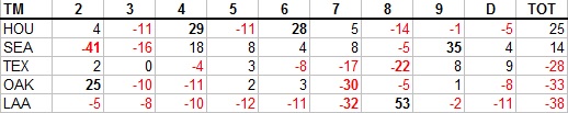
Houston had the best middle infield production in MLB. I never would have guessed that Seattle was above-average offensively; park illusions and narratives remain powerful things. Nelson Cruz allowed their outfield to lead the AL in RAA, and yet the three outfielders (+37) did not completely offset the horrid catchers (-41). The only team in the majors other than Los Angeles to have just one above-average position was the White Sox; that it was the second-best position in the majors must make Mike Trout really angry sometimes.

Washington had the majors’ most productive outfield thanks to Bryce Harper’s amazing season. Miami had the worst corner infielders in the NL. Remember that these figures are against the major league average, so the Mets aren’t being compared to a lower baseline than the Royals--their position players were better offensively relative to their positions.

The Cubs and Reds tied for the most productive corner infields in MLB, doing it in opposite ways, Chicago with near perfect balance and Cincinnati with a big season from Joey Votto and solid production from Todd Frazier. But the Reds gave it all back with the majors’ worst outfield, led by their center field disaster which they compounded by leading off their center fielders in 75 games (shortstop 66, left field 12, second base 7, right field 2).

As mentioned above, the Angels were below average at eight of nine spots; uptown the Dodgers were the only team without a below average position. Solidly above average everywhere with only one standout position led to the second highest composite RAA in the majors. Their archrivals were right behind with just two less RAA and one below average position, but three positions were standouts and they led the majors in infield RAA and the NL in middle infield RAA. Arizona had the worst middle infield RAA in the majors.
The full spreadsheet is available here.
Monday, January 04, 2016
Hitting by Lineup Position, 2015
I devoted a whole post to leadoff hitters, whether justified or not, so it's only fair to have a post about hitting by batting order position in general. I certainly consider this piece to be more trivia than sabermetrics, since there’s no analytic content.
The data in this post was taken from Baseball-Reference. The figures are park-adjusted. RC is ERP, including SB and CS, as used in my end of season stat posts. The weights used are constant across lineup positions; there was no attempt to apply specific weights to each position, although they are out there and would certainly make this a little bit more interesting:

For the seventh consecutive season, NL #3 hitters are the best position in baseball. It is interesting to note that the NL is superior at the majority of the lineup spots (1, 2, 3, 5, 7), yet the AL holds a slight advantage in RG from spots 1-8 combined (4.49 to 4.45). #2 hitters outperformed #5 hitters in both leagues, although the #5 spots remain home to a higher ISO than #2. Last year AL #6 hitters were quite poor (better than only three other spots); that was just a blip and the AL #6 hitters were easily the best of the eight 6-9 spots in 2015.
Next are the team leaders and trailers in RG at each lineup position. The player listed is the one who appeared in the most games in that spot (which can be misleading, especially for spots low in the batting order where many players cycle through):


The Cubs #8 and #9 spots mess up both the leaders and trailers list for the NL as the former trail thanks to Joe Maddon’s singular devotion to batting the pitcher eighth, which he did for almost every game the Cubs played in a NL park. Last year I noted in this spot that you could see why Seattle wanted Nelson Cruz as they had the AL’s worst cleanup production; Cruz turned that completely around in 2015. As I write this, a Brandon Phillips trade to Washington appears to be in the works and the MLBN commentators are seriously discussing the possibility that Dusty could lead him off. And how sad to see lineup spots led by Joe Mauer, Albert Pujols, and Ryan Howard on the trailers list (ok, the first two are sad, the latter is hilarious).
The next list is the ten best positions in terms of runs above average relative to average for their particular league spot (so AL leadoff spots are compared to the AL average leadoff performance, etc.):

And the ten worst:

I’ve run this report since 2009; -53 is surpassed only by last year’s TEX #3 hitters (for the record, they were +6 in 2015). Again, though, this is essentially comparing a full-time pitcher spot in the order to NL #8 hitters, which include only a smattering of pitchers, so it’s a misleading number (except to the extent that Joe Maddon did punt on his #8 lineup spot).
The last set of charts show each team’s RG rank within their league at each lineup spot. The top three are bolded and the bottom three displayed in red to provide quick visual identification of excellent and poor production:


The full spreadsheet is available here.