
Is it just me, or does this seem patently unfair to the other 28 teams?
Good to see that Yahoo! is well-prepared for continuous interleague play in 2013.
Thursday, December 27, 2012
Great Moments in Yahoo! Schedules
Monday, December 17, 2012
Hitting by Position, 2012
Offensive performance by position (and the closely related topic of positional adjustments) has always interested me, and so each year I like to examine the most recent season's totals. I believe that offensive positional averages can be an important tool for approximating the defensive value of each position, but they certainly are not a magic bullet and need to include more than one year of data if they are to be utilized in that capacity.
The first obvious thing to look at is the positional totals for 2012, with the data coming from Baseball-Reference.com. "MLB” is the overall total for MLB, which is not the same as the sum of all the positions here, as pinch-hitters and runners are not included in those. “POS” is the MLB totals minus the pitcher totals, yielding the composite performance by non-pitchers. “PADJ” is the position adjustment, which is the position RG divided by the overall major league average (this is a departure from past posts; I’ll discuss this a little at the end). “LPADJ” is the long-term positional adjustment that I use, based on 2002-2011 data. The rows “79” and “3D” are the combined corner outfield and 1B/DH totals, respectively:

The 2012 positional RG averages demonstrate a fairly remarkable convergence near 4.8 for a number of positions (third base, the three outfield spots, and DH all between 4.75-4.85). While this is nothing more than a one year data fluke, it’s the kind of thing that is fun when you find it. One thing that has persisted is left fielders being outperformed by their stronger armed brethren in right, although 4.8 RG represents a bounce back from their pitiful 4.45 performance in 2011. The other most notable position performance came from backstops, who were close to league average and outhit the middle infielders. For an odd but meaningless fact, note the excellent stolen base record of DHs--their 80 SB% was the best of any position.
Pitchers reached a new low in 2012; their .06 RG is close to breaking linear weights, and their PADJ of 1 represents a new all-time low (the previous nadir was 5). The team pitcher data below (and all of the team data for all positions that follows in this post) are park-adjusted. RAA is baselined against the overall major league average for the position (with left field and right field pooled). It’s worth noting that the formula I’m using for Runs Created is limited to the basic categories, so sacrifices are ignored, which could make a difference for pitchers:

An eighteen run range between the best and worst team pitchers is pretty common. Washington’s pitchers were clearly the best, leading in both batting and secondary average. Cincinnati’s BA was only five points lower and they tied for second in isolated power (behind Milwaukee), but only San Diego’s pitchers had a lower walk rate than the Reds. At the other end of the power and overall offense spectrum was Pittsburgh. They were last with a -.7 RG and -8 RAA, but their isolated power was a woeful .003 (the next lowest was Houston at .018).
Pittsburgh pitchers mustered just one double in 290 at bats--I didn’t check, but it’s tough to imagine any teams in history have topped that. AL pitchers in aggregate came pretty close, though, with just three doubles in 282 AB (.011 ISO). All AL teams had a pitcher reach base safely except the Tigers, but their 0-13 was offset by seven sacrifices to lead the AL. The best hitting pitchers were Cleveland with a .290 across-the-board slash line (six singles in 21 at bats).
I don’t bother running a full table for the team leaders in RAA at the positions that actually hit, as these are usually uninteresting (Tigers third basemen were good offensively? You don’t say). The leading teams by position were:
C--SF, 1B--CIN, 2B--NYA, 3B--DET, SS--WAS, LF--MIL, CF--PIT, RF--STL, DH--NYA
I find it a lot more interesting to look at the worst positions (the player listed is the one with the most games played for the team at the position):

Kevin Youkilis takes a bad rap here as he had a respectable 720 OPS in 316 PA as the Chicago third baseman; his teammates combined for 466 in 339 PA. If you endeavor to score 1,000 runs for the season, it might be a good idea to make sure that you don’t get the worst offensive production out of two of your positions. No amount of corner power can mitigate that. Although Pittsburgh’s left fielders were the worst in total value relative to their position, Seattle’s shortstops had the overall worst performance with 2.5 RG. They were actually matched in production by their team’s pitchers, who hit a raw .227/.261/.273 for 2.5 RG (the park adjustment should not be applied to AL pitchers because all of their PA--except for rare cases that tend to involve Joe Maddon--come on the road). Obviously the pitchers’ performance came over a microscopic 23 PA, but it’s a factoid with some nice shock value.
A few years ago I wrote a bit about teams with unusual profiles of offense by position. This topic has been of particular interest to me in recent years because of the way the Indians have been constructed--often they have gotten good production from positions on the right side of the defensive spectrum while struggling at the more offensively-inclined positions. The easiest way I’ve come up with to express this numerically is the correlation between a team’s RG by position and the long-term positional adjustment (I’ve pooled left and right field but not 1B and DH in this case; pitchers are excluded for all teams and DHs excluded for NL teams, and I’ve broken the lists out by league because of this):

As I suspected, the Indians displayed one of the strongest inverse correlations between positional expectation and actual production with the most negative correlation in the AL. Cincinnati had the strongest correlation in the majors; contrasting the two Ohio teams should illustrate how these results came about:

The Reds got their best production out of first base and the corner outfielders, and their middle infielders and catchers had relatively low RGs. Only center field produced contrary to expectation in a meaningful way. The Indians, on the other hand, got no offense from first base and left field. While right field was productive as would be expected, the other top positions included the middle infielders and catcher.
Perhaps it’s my experience as an Indians fan speaking, but I feel that the type of pattern displayed by the Indians in recent years is the most frustrating as a fan. Cleveland has gotten solid production from catcher (Martinez/Santana), second base (Kipnis recently), shortstop (Peralta/Cabrera), center field (Sizemore/Brantley)...and has struggled to find first basemen (Garko/LaPorta/Kotchman) or left fielders (Michaels/Duncan/Damon/etc) who could provide league average (overall, not even relative to position) production.
The following charts give the RAA at each position for each team, split up by division. The charts are sorted by the sum of RAA for the listed positions. As mentioned earlier, the league totals will not sum to zero since the overall ML average is being used and not the specific league average. Positions with negative RAA are in red; positions with +/- 20 RAA are bolded:

Washington led the NL in infield RAA, with excellent performances from first base and shortstop. The Desmond-led shortstops stood out enough to lift the Nats to the NL lead in middle infield RAA, and they just missed leading in corner infield RAA as well. The worst production from corner infielders in the NL was a dead heat between the Phillies and the Marlins. Miami joined Cleveland and Seattle as the only teams with -20 RAA performances from both first base and left field.

St. Louis and Milwaukee boasted the top two outfields in the NL; the Brewers had the best production from corner outfielders in the majors, but St. Louis’ average production in center field gave them a higher composite RAA. Cincinnati’s offense was a conundrum, ranking fourth to last in the league in park adjusted R/G. Their component performance was better than that, but even so one might have expected more than a composite 20 RAA from their positions. The Reds’ center fielders were dreadful, though. Leading the majors in first base RAA may seem surprising at first glance, but much of Frazier’s hot stretch came as Votto’s replacement (884 OPS in 149 PA). Pittsburgh’s middle infielders ranked last in the NL, but at just -15 RAA. Houston was last in the majors in corner outfield RAA and their center fielders were only one run worse than Cincinnati’s for a total of -75 outfield RAA, 29 runs worse than the next sorriest outfit. That outfield belonged to the Cubs, who were also last in the NL in corner infield and overall infield RAA.

San Francisco’s offense was a wonderful example of above-average balance plus the MVP, enough to rank third in the league in RAA. Chase Headley powered the Padres to the NL’s highest corner infield RAA.

New York led the majors in middle infield and overall infield RAA. Boston’s outfield was the worst in the AL, and just two above average positions speaks to how poorly their season went. The amount of red on this chart is fairly staggering given the extent to which the media still hypes the difficulty of pitching in the AL East.

Detroit’s much-hyped duo contributed a whopping 90 RAA to lead corner infielders, but the black hole at second base gave 27 runs back, and the lack of any other standout positions aside from center once again reinforce just how stupid it was to mention “1,000 runs” and this team in the same sentence. Their corner outfielders were last in the AL in RAA. Minnesota was last in the majors in middle infield RAA, while Cleveland achieved the same with their corner infielders. In fact, despite Detroit’s 90 corner infield RAA, the division combined for -11 RAA from corner infielders as only Chicago got above-average production from either position.

Los Angeles led the AL in corner outfield RAA and the majors in total outfield RAA. The lack of offense in Seattle is as predictable as the rain and the votes for liberals, but marveling at it never gets old (unlike the other constants of Seattle life). Their corner outfielders were last in AL RAA and their infielders last in the majors. Only their catchers, led by John Jaso, were above average.
The full spreadsheet is available here.
Switching gears to some technical explanation, the position adjustments I am now using are based on comparing each position’s RG to the overall major league average. Previously, the adjustments I used were based on comparing each position to the league average with pitchers removed. The latter comparison is certainly cleaner, but it was inconsistent with how I was actually calculating RAA and RAR, which was comparing each player to the overall league average.
The new method is not perfect either; one could very persuasively argue that pitchers hitting should be removed from the league average for all computations. I’ve always subscribed to the notion that the league totals for any average-baselined stat should be zero, and that the league average should be the same whether one is comparing players or teams. If you take out pitchers from the league average, but leave them in for teams (and pitcher hitting does factor into actual team offensive output, even if the variance is much lower than for other positions), then you wind up with a league which rates as below average offensively.
Of course, the notion of looking at the leagues as self-contained units made much more sense when they were. Now the AL averages include not only pitchers hitting, but also performances compiled against NL teams. I cling to the notion of separate leagues for computational purposes because the separation is still great enough that it’s a better approximation than lumping both leagues together, but both are imprecise.
This is a particular problem for positional adjustments, because the AL average and the NL average include different proportions of pitcher’s hitting. In the pre-interleague days, even if one tied themself to using the league average including pitchers, it may have made sense to use a PADJ tied to all positions for the NL and less pitchers for the AL. I choose not to complicate things by using a different set of positional adjustments for each league, especially now that both choices are at least partially incorrect. This imprecision does not cause huge distortion, but I need to disclose it nonetheless.
Monday, December 10, 2012
Hitting by Lineup Position, 2012
I devoted a whole post to leadoff hitters, whether justified or not, so it's only fair to have a post about hitting by batting order position in general. I certainly consider this piece to be more trivia than sabermetrics, since there’s no analytical content.
The data in this post was taken from Baseball-Reference. The figures are park-adjusted. RC is ERP, including SB and CS, as used in my end of season stat posts. The weights used are constant across lineup positions; there was no attempt to apply specific weights to each position, although they are out there and would certainly make this a little bit more interesting.

NL #3 hitters retained the highest RG of any league-slot for the fourth consecutive year. AL teams were more balanced between #3 and #4, with the cleanup hitters holding a slight edge in RG built on BA (.275 to .264) but slightly less power (.189 to .193 ISO). NL leadoff me had a lower OBA than any other NL slots except 7, 8, and 9, and the #7 hitters managed to exceed their overall production (if you remove the Reds leadoff hitters, they did muster a higher RG than the #7s). AL teams were much better at leadoff, but gave those gains right back with poor #2 hitters.
Next, here are the team leaders in RG at each lineup position. The player listed is the one who appeared in the most games in that spot (which can be misleading, particularly for the bottom the batting order where there is no fixed regular, or injury cases like Evan Longoria getting stuck with the blame for the Rays’ cleanup hitters):

A few teams had the best production in their league at a pair of slots that are considered particularly important--the Angels at #1/2, the Tigers at #3/4, the Giants at #1/4. But the Cardinals got the best production of their NL rivals from #2, #6, and #8.
And the least productive:

The Astros and Royals both had two black holes in the middle of their order while the Chicago teams each trailed at #2 and a lower lineup position. Note that even in this lousy company, the Reds leadoff hitters had the worst OBA among the other league-worst positions except for the Pirates #9.
The next chart displays the top ten positions in terms of runs above average, compared to the average position for their league. To emphasize that, the RAA numbers here are, for example, the Angels #1 hitters compared to the other AL #1 hitters:

Even when you compare to the average for each slot, the top RAA figures are dominated by the expected slots. Please don’t use the fact that Trout outshone his leadoff peers by more than Cabrera outshone his #3 peers to bolster an MVP case--that would be silly on principle, and the performance of other players are include in the team figures reported here.
And the worst positions:

I wrote enough about Cincinnati’s leadoff hitters in an earlier post, but to pile on: their 2.6 RG was worse than any non-#9 spot for any other major league team. It was worse than the #9 slot of all but one American League team (CHA), making it the second-worst non-pitcher slot in the major leagues. Washington’s #9 hitters outhit Cincinnati’s leadoff hitters (2.7 RG to 2.6). They also had the 13th lowest walk rate of any position (8th lowest excluding NL #9s). Their OBA was 15th lowest of any position--and rock bottom when NL #9s are excluded. I marveled a few times during the season at Dusty Baker’s choices at the top of the order, but I had no idea that it was this bad until digging into the numbers.
I will close this post with a chart showing each team’s rank in RG in their league for each slot. The top and bottom three teams in each league have been highlighted. First the AL:

Last year this chart for Boston was filled with bold--this year they ranked in the bottom half of the AL in six of the nine spots, and only the #6 hitters weren’t borderline. Not much has changed in Seattle, except last year their ineptitude was centered at 4-6 rather than 1-4.
In the NL:

Based on talent or actual performance, Cincinnati had no business finishing fourth last in the NL in park-adjusted R/G. But that outcome starts to make a little more sense when you consider the leadoff disaster coupled with poor production from the cleanup hitters (.263/.323/.428).
Follow this link for the full spreadsheet.
Monday, December 03, 2012
Statistical Meanderings 2012
This post is probably shorter than in past years, which is good for you if you choose to read. There’s not much of substance here--just a few observations about quirky things in my stat reports that happened to catch my eye. Jayson Stark-level stuff, but with better (I hope) stats.
* If I could only know one statistic regarding each major league season, I would want to know the league average of runs per game. It is the simplest way to boil down the environment in which the game is played into a single number. As such, I like to make note of how it fluctuates from year to year, even if one cannot draw any conclusions about long-term trends from single seasons. In fact, I consider this number so important that I refer to it as N in my league stat report.
Runs were up slightly in the majors in 2012 relative to 2011, with an uptick in NL scoring leading the way. N for the 2012 was AL was 4.45 versus 4.46 in 2011, but the NL’s crept up to 4.22 from 4.13. I should note that interleague play has made it more difficult to look at N for each league, since runs no longer equal runs allowed for the league. The version here is just runs scored, which I persist with by convention and expediency rather than anything I can justify to you.
* Home W% also rebounded a bit after cratering in 2011. Home teams won at a .533 clip in 2012, up from .526, but well behind the conspiracy theory-inspiring .559 of 2010. Four of thirty teams had better record on the road, while there were seven such teams in 2011, and just two in 2012. Again, trends need to be observed over time.
* As the Rays fell out of contention in September, one factor that was bandied about in mainstream circles was a decline in their team fielding. It’s true that Tampa went from leading the majors in modified FA in 2011 (.978) to bringing up the rear in the AL in 2012 (.963), but their DER remained excellent. Tampa’s .694 was good enough for a virtual five-way tie for the ML lead (SEA, LAA, OAK, and WAS were all at either .695 or .694).
And the Rays pitching was outstanding; they narrowly missed leading the majors in both starter (their 3.90 led the AL by a large margin as DET was second at 4.26, but WAS was at 3.85) and reliever eRA (the closest challenger to their 3.19 was the Reds at 3.44).
* Given the fact that Colorado spent a good chunk of the season dabbling with a pitch-restricted four man rotation, it’s not a surprise that their starting staff put up some unusual numbers. But there are a few that really catch the eye:
- COL got quality starts in just 17% of their games (Coors doesn’t help QS% of course, but regardless of the park, you don’t get a quality start without pitching six innings); MIN was next lowest at 38%.
- COL starters logged 4.72 innings per start; MIN was next with 5.43
- COL starters had a 5.71 eRA (this figure is park-adjusted), but it was not the worst in the majors. That fate belonged to...the Twins (5.73).
* The four lowest scoring teams in the majors played in the National League, which isn’t shocking, but the fact that every AL team outscored the Reds was very surprising to me. CIN’s 4.05 R/G was well ahead of their two division rivals, at least--Houston (3.64) and the Cubs (3.67) brought up the rear, and Miami didn’t do much better (3.76). The Marlins and Reds were the two most underachieving offensive teams in terms of scoring fewer runs than predicted by Base Runs, with respective shortfalls of 47 and 40 runs.
Of course, that means the fifth lowest-scoring offense belonged to an AL team, and if you’ve been paying any attention at all over the last few seasons, you should guess that it was Seattle. You’d be right--the Mariners mustered just 4.06 R/G, which was actually better than their RC/G (4.04). Seattle was last in home R/G (3.17--the Mets were next at 3.54), but ranked eighth in road R/G (4.47; for reference, TEX was at 4.46). The Mets were also much better on the road, ranking seventh just ahead of Seattle with 4.48. In case you were wondering, the home and road R/G are raw numbers.
* For the past three years, I’ve included a chart with each playoff team’s runs above average on offense and defense, and in all three, playoff teams on average have been better offensively than defensively. That was not the case in 2012--it was a big year for playoff team defense:
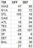
The two teams that jump off the page for me are the Tigers and the Giants. All season I had a good time snarking at the expense of those wild-eyed dreamers who thought that Detroit might have a chance at scoring 1000 runs, and in fact the Tigers were below the AL average in R/G after adjusting for park. It would have seemed difficult to believe two years ago that San Francisco would win another World Series but do it with the offense contributing more than the defense.
* The Mets factoids provide a great segue into discussing Citi Field’s park factor. When significant changes are made to a park, my usual course of action is to treat it as a brand new park. This is not an entirely satisfactory solution, but neither is regressing a park to 1.00 as my methodology also does. One could attempt to develop a hypothetical mean for a park, considering factors such as dimensions, altitude, temperature, knowledge about how the park played before alterations, and other factors. My approach keeps it simple, but not necessarily more accurate--deal only with the park under its current dimensions, use a maximum of five years of data in whichever direction (past or future) that you can grab it from (although 2012 park factors are necessarily 100% based on past experience at this point), and regress heavily.
Considering only 2012, I have Citi Field’s park factor as .96 for runs and 1.02 for home runs. If instead I’d used all four years of available data (2009-2012), it would have been .96 and .95. In this case, regardless of how I figured the park factor, it wouldn’t have made any difference for Mets players.
* NL relief leaders in strikeout rate:

Kimbrel and Chapman are in video game territory, but the most surprising name to me is Jason Grilli.
What I list as KG and WG are strikeouts and walks per plate appearance, scaled to the league average of plate appearances per game. I’ve always advocated looking at strikeout and walk rates per PA rather than per inning, and am happy to see that PA-denominated rates have gained a lot of traction in stathead circles (if you think I’m implying causation between the two causes of this sentence, I’m not). Why have I chosen to scale them to PA-games rather than just leaving them as per PA proportions or percentages?
For the same reason I express batter’s RC rates as per 25.5 outs rather than per out--I have a much better feel for the per game scale, and since it’s only a scalar multiplication, there’s no harm done in terms of the ability to make comparisons . Using the actual league average of PA/G can admittedly create some odd results that don't occur when using outs/game. Outs/game are generally fixed across leagues, but PA/G can vary significantly across contexts. The same is true for K/9. If K/PA is constant between two entities, K/9 will be higher for the entity with a higher average of PA/G (this is the biggest reason I dislike K/9). So the KG figures I report will rank an AL pitcher with the same K/PA ahead of a comparable NL pitcher.
I don’t really consider this a problem, since I’d recommend using adjusted statistics when comparing across leagues anyway. But I can see why for some might find that objectionable for a single season; perhaps next year I’ll use the major league average PA/G to set the scale.
* I am easily amused by teams whose estimated W%s are roughly equal and pitchers whose various run averages are similar. A great example of the latter this year was Josh Johnson. Johnson’s RA was 3.95 and his bullpen support was pretty average, so his RRA was just a touch lower at 3.90. He didn’t allow many unearned runs, so his 3.81 ERA was pretty close to his actual RA. His eRA was 3.81, so his peripheral statistics were in line with his actual RA. And his dRA was 3.90 thanks to his .304 %H being right in line with the NL average of .303.
* Remember when Aaron Cook was a nightmare for sabermetrics? The trashiest site in sports media was all over that case, but in the end, not only was Cook unable to sustain success with a 1.9 KG (and who could have ever forseen that?), his .295 %H was indistinguishable from the AL’s .296 average. And his 5.89 dRA was equal to his 5.89 RRA. Aaron Cook 2012 could be the DIPS poster child.
Speaking of former DIPS debunkers, how did JA Happ manage to get his strikeout rate up to 8.6?
* Major league pitchers with 15 or more starts who averaged at least 100 pitches/start (treating stray relief appearances as half a start): Homer Bailey, Clay Buchholz, Madison Bumgarner, Matt Cain, Johnny Cueto, Yu Darvish, RA Dickey, Yovani Gallardo, Dillon Gee, Gio Gonzalez, Miguel Gonzalez, Cole Hamels, Aaron Harang, Matt Harrison, Felix Hernandez, Phil Hughes, Ubaldo Jimenez, Josh Johnson, Ian Kennedy, Clayton Kershaw, Cliff Lee, Tim Lincecum, Justin Masterson, Jon Niese, Jake Peavy, David Price, CC Sabathia, Chris Sale, Max Scherzer, Jamie Shields, Jason Vargas, Justin Verlander, Edinson Volquez, CJ Wilson.
You are more than free to quibble on this, but the name that really jumps out to me on that list is Dillon Gee. I would argue that the other pitchers on the list pitched very well in 2012 (even if that was a surprise, as in the case of Miguel Gonzalez) or had a reputation (like veteran workhorse Aaron Harang or whatever-the-heck-he-is Ubaldo Jimenez). And Gee only made 17 starts, so his workload was not comparable to the pitchers who were in the rotation all year. Still, Gee was -8 RAA in 2012 and -13 in 2011.
His teammate Jon Niese may have caught your eye as well, but what’s really interesting is that both Gee (103 pitches/start) and Niese (101) actually threw more pitchers per start than their knuckleball and Cy Young contender teammate RA Dickey (100).
* There have been a number of trades in recent years which have involved trading an established starting pitcher for a package that includes a young major league or very advanced starting pitching prospect, only to see the latter outperform the former. Sometimes the superior performance has only been for one season, and either the jury is still out on which guy ultimately is more effective or a second season has given a mixed results (examples include Daniel Hudson/Edwin Jackson, Clayton Richard/Jake Peavy, Jarrod Parker/Trevor Cahill). One of the funniest (and the most personal for me) is the Ubaldo Jimenez trade. I was vehemently opposed to this trade from Cleveland’s perspective when it went down. What happened this year was that all three pitchers involved in the trade were ineffective, but that still is a big win for Colorado when you consider the contract status of all involved:
![]()
The Indians pitching in general was awful. I wrote a little bit above about the horrible starting pitching of Colorado and Minnesota, but Cleveland was right behind. The Indians 5.64 IP/S trailed only those two and Kansas City, their 45 QS% was sixth-lowest in MLB, and their 5.65 starters eRA trailed only the terrible two as well (fourth-worst was the Royals, again, but with a relatively Verlanderesque 5.29). Cleveland allowed 5.58 runs/game on the road, worst in the majors (Houston was next at 5.42; Minnesota next in the AL all the way down at 5.12). Not that they were much better at home--4.85 RA/G was the fourth-most (Colorado was worst, of course, with 6.46).
Their starting pitchers were every bit as dreadful individually as the team totals would indicate:

At least two were above replacement level. 77 primarily AL pitchers made 15 or more starts, and in terms of RAR, the Indians boasted six of the bottom nineteen. Obviously Manny Acta’s fault.
* Adam Dunn hit .204 this year, which was a bit of a disappointment to me. Throughout the season, I was hoping that his final average would slip below the arbitrary Mendoza line in order to have a legitimately solid batting season at that BA level to point too (Dunn was +12 HRAA). It is a bit of consolation that his park-adjusted BA is .199, and that his .445 secondary averaged led all AL hitters with 400+ PA (Jose Bautista and David Ortiz each had a higher SEC and were close to that cutoff). Dunn also came tantalizingly close to breaking the strikeout record, but his 222 fell one short of Mark Reynolds’ 2009 total.
* Bryan LaHair and Anthony Rizzo have obviously had very different pasts and likely will have very different futures. But in 2012, they were statistically about as close as you could ever hope to see from two guys at the same position on the same team:
![]()
The only appreciable difference is in the shape of production, with Rizzo posting a higher BA and LaHair a higher SEC.
* Another fun first base pair is erstwhile division rivals Mark Teixeira and Adrian Gonzalez:
![]()
The differences here are more marked, thanks to a bigger gap in shape of performance and Gonzalez’s extra 166 PA. The collapse of Gonzalez’s secondary contributions was well documented during the season, and I have no insight to offer regarding the cause. Since Gonzalez became a full-time player in 2006, his annual raw secondary averages have been:
.247, .288, .320, .351, .489, .371, .327, .231
If Ned Colletti knew what secondary average was, he might be concerned.
* Here is a pair of veteran teammates:
![]()
Looking at just their offensive contributions, you can see that they were equally effective when in the lineup, albeit with a shape difference (player A had a superior BA, player B a superior SEC). Obviously Player A was in the lineup every day, while Player B missed some time. It isn’t reflected here, but Player A also “played” a tougher fielding position. All told, though, there appears to be little good reason why Player A is still celebrated and Player B is reviled. Don’t overthink this one--you know who they are.
Monday, November 26, 2012
2012 Leadoff Hitters
This post kicks off a series of posts that I write every year, and therefore struggle to infuse with any sort of new perspective. However, they're a tradition on this blog and hold some general interest, so away we go.
This post looks at the offensive performance of teams' leadoff batters. I will try to make this as clear as possible: the statistics are based on the players that hit in the #1 slot in the batting order, whether they were actually leading off an inning or not. It includes the performance of all players who batted in that spot, including substitutes like pinch-hitters.
Listed in parentheses after a team are all players that appeared in twenty or more games in the leadoff slot--while you may see a listing like "ATL (Bourn)” this does not mean that the statistic is only based solely on Bourns's performance; it is the total of all Atlanta batters in the #1 spot, of which Bourn was the only one to appear in that spot in twenty or more games. I will list the top and bottom three teams in each category (plus the top/bottom team from each league if they don't make the ML top/bottom three); complete data is available in a spreadsheet linked at the end of the article. There are also no park factors applied anywhere in this article.
That's as clear as I can make it, and I hope it will suffice. I always feel obligated to point out that as a sabermetrician, I think that the importance of the batting order is often overstated, and that the best leadoff hitters would generally be the best cleanup hitters, the best #9 hitters, etc. However, since the leadoff spot gets a lot of attention, and teams pay particular attention to the spot, it is instructive to look at how each team fared there.
The conventional wisdom is that the primary job of the leadoff hitter is to get on base, and most simply, score runs. So let's start by looking at runs scored per 25.5 outs (AB - H + CS):
1. LAA (Trout), 7.7
2. DET (Jackson/Berry), 6.6
3. SF (Pagan/Blanco), 6.0
Leadoff average, 4.9
ML average, 4.3
25. SEA (Ackley/Suzuki/Figgins), 4.2
28. LA (Gordon/Ellis/Victornio/Gwynn), 3.9
29. MIA (Reyes/Petersen), 3.9
30. CIN (Cozart/Phillips), 3.8
Detroit’s leadoff hitters performed very well in context-neutral measures as you’ll see, but you also are well aware of the biases inherent to runs scored, and having Cabrera and Fielder to drive you in is nice. Likewise, Jose Reyes had a fine season, but Miami didn’t score any runs (also, Reyes was only in the leadoff spot for 95 games).
Speaking of getting on base, the other obvious measure to look at is On Base Average. The figures here exclude HB and SF to be directly comparable to earlier versions of this article, but those categories are available in the spreadsheet if you'd like to include them:
1. LAA (Trout), .382
2. DET (Jackson/Berry), .361
3. NYA (Jeter), .356
4. ATL (Bourn), .341
Leadoff average, .320
ML average, .315
28. SEA (Ackley/Suzuki/Figgins), .258
29. LA (Gordon/Ellis/Victornio/Gwynn), .278
30. CIN (Cozart/Phillips), .247
The five point margin between the leadoff and overall OBA is in usual range, perhaps a little on the low end (the gap was seven points in 2011 and two points in 2010).
I have been doing this review of leadoff hitters since 2006. The lowest OBA for a team’s leadoff hitters in each of those seasons, the gap between #29 and #30 are listed in the table below, and that team’s adjusted OBA relative to the major league average for leadoff hitters in that season:

The point of this chart--the Reds leadoff hitters were really, really bad. In my last post, I wrote about how bad Cincinnati’s offense was. On paper, it should have been much better, and hemorrhaging outs at the top of the lineup was certainly a contributing factor. Dusty Baker was content to allow Zack Cozart to make an out three out of every four times from the leadoff spot. To be fair, Cozart’s low OBA was a bit of a surprise, but there was nothing in his record that suggested that he would be a good leadoff option.
The next statistic is what I call Runners On Base Average. The genesis of it is from the A factor of Base Runs. It measures the number of times a batter reaches base per PA--excluding homers, since a batter that hits a home run never actually runs the bases. It also subtracts caught stealing here because the BsR version I often use does as well, but BsR versions based on initial baserunners rather than final baserunners do not.
My 2009 leadoff post was linked to a Cardinals message board, and this metric was the cause of a lot of confusion (this was mostly because the poster in question was thick-headed as could be, but it's still worth addressing). ROBA, like several other methods that follow, is not really a quality metric, it is a descriptive metric. A high ROBA is a good thing, but it's not necessarily better than a slightly lower ROBA plus a higher home run rate (which would produce a higher OBA and more runs). Listing ROBA is not in any way, shape or form a statement that hitting home runs is bad for a leadoff hitter. It is simply a recognition of the fact that a batter that hits a home run is not a baserunner. Base Runs is an excellent model of offense and ROBA is one of its components, and thus it holds some interest in describing how a team scored its runs, rather than how many it scored:
1. LAA (Trout), .332
2. NYA (Jeter), .330
3. DET (Jackson/Berry), .327
5. COL (Fowler/Scutaro/Young), .312
Leadoff average, .289
ML average, .282
27. SEA (Ackley/Suzuki/Figgins), .258
28. LA (Gordon/Ellis/Victorino/Gwynn), .252
29. PIT (Presley/Tabata/Marte), .250
30. CIN (Cozart/Phillips), .224
Angels leadoff hitters led the majors with 30 homers (PHI was next with 24), but their advantage in getting on base was large enough that even with home runs removed as times on base, they still led the league in ROBA.
I will also include what I've called Literal OBA here--this is just ROBA with HR subtracted from the denominator so that a homer does not lower LOBA, it simply has no effect. You don't really need ROBA and LOBA (or either, for that matter), but this might save some poor message board out there twenty posts, so here goes. LOBA = (H + W - HR - CS)/(AB + W - HR):
1. LAA (Trout), .347
2. NYA (Jeter), .336
3. DET (Jackson/Berry), .334
5. COL (Fowler/Scutaro/Young), .320
Leadoff average, .294
ML average, .290
27. TOR (Lawrie/Davis/Escobar/Johnson), .263
28. LA (Gordon/Ellis/Victorino/Gwynn), .254
29. PIT (Presley/Tabata/Marte), .254
30. CIN (Cozart/Phillips), .229
There is a high degree of repetition for the various OBA lists, which shouldn’t come as a surprise since they are just minor variations on each other.
The next two categories are most definitely categories of shape, not value. The first is the ratio of runs scored to RBI. Leadoff hitters as a group score many more runs than they drive in, partly due to their skills and partly due to lineup dynamics. Those with low ratios don’t fit the traditional leadoff profile as closely as those with high ratios (at least in the way their seasons played out):
1. CIN (Cozart/Phillips), 2.2
2. SF (Pagan/Blanco), 2.1
3. ARI (Bloomquist/Parra/Eaton), 2.1
4. KC (Gordon/Dyson), 2.1
Leadoff average, 1.7
27. PHI (Rollins/Pierre), 1.5
28. BAL (Markakis/Chavez/McLouth), 1.4
29. TEX (Kinsler), 1.4
30. BOS (Ellsbury/Aviles/Nava/Podsednik), 1.3
ML average, 1.1
Again, this is not a quality list, as indicated by Cincinnati leading the way. While Cozart and Co. may have been terrible, at least they avoided driving in any runs so as to upset the traditional leadoff profile.
A similar gauge, but one that doesn't rely on the teammate-dependent R and RBI totals, is Bill James' Run Element Ratio. RER was described by James as the ratio between those things that were especially helpful at the beginning of an inning (walks and stolen bases) to those that were especially helpful at the end of an inning (extra bases). It is a ratio of "setup" events to "cleanup" events. Singles aren't included because they often function in both roles.
Of course, there are RBI walks and doubles are a great way to start an inning, but RER classifies events based on when they have the highest relative value, at least from a simple analysis:
1. LA (Gordon/Ellis/Victorino/Gwynn), 1.8
2. ATL (Bourn), 1.5
3. STL (Furcal/Jay), 1.5
4. MIN (Span/Revere), 1.3
Leadoff average, 1.0
ML average, .7
27. BAL (Markakis/Chaez/McLouth), .7
28. WAS (Lombardozzi/Desmond/Werth/Espinosa), .7
29. PIT (Presley/Tabata/Marte), .6
30. CIN (Cozart/Phillips), .6
What’s interesting here is that Cincinnati’s leadoff hitters did not really fit the traditional profile despite failing to drive in any runs. The Reds had the lowest RER as their leadoff hitters drew the fewest walks (37) and stole the fewest bases (10) of any team. Even so, their RER denominator wasn’t very good, as their isolated power of .119 was still below the leadoff average of .130.
Speaking of stolen bases, last year I started including a measure that considered only base stealing. Obviously there's a lot more that goes into being a leadoff hitter than simply stealing bases, but it is one of the areas that is often cited as important. So I've included the ranking for what some analysts call net steals, SB - 2*CS. I'm not going to worry about the precise breakeven rate, which is probably closer to 75% than 67%, but is also variable based on situation. The ML and leadoff averages in this case are per team lineup slot:
1. LAA (Trout), 40
2. SD (Venable/Denorfia/Cabrera/Amarista), 21
3. OAK (Crisp/Weeks), 18
4. SF (Pagan/Blanco), 18
Leadoff average, 9
ML average, 4
25. NYA (Jeter), 1
28. NYN (Tejada/Torres/ Nieuwenhuis), -4
29. PIT (Presley/Tabata/Marte), -8
30. ARI (Young), -24
While the Reds only stole 10 bases from the leadoff spot, they were only caught once, so their net 8 was essentially average. The Yankees were next with just sixteen attempted steals. If Chris Young’s basestealing attempts are not toned down in Oakland, then the media may get its moment to declare that Moneyball is dead.
Let's shift gears back to quality measures, beginning with one that David Smyth proposed when I first wrote this annual leadoff review. Since the optimal weight for OBA in a x*OBA + SLG metric is generally something like 1.7, David suggested figuring 2*OBA + SLG for leadoff hitters, as a way to give a little extra boost to OBA while not distorting things too much, or even suffering an accuracy decline from standard OPS. Since this is a unitless measure anyway, I multiply it by .7 to approximate the standard OPS scale and call it 2OPS:
1. LAA (Trout), 899
2. DET (Jackson/Berry), 821
3. NYA (Jeter), 793
4. COL (Fowler/Scutaro/Young), 768
ML average, 725
Leadoff average, 721
28. SEA (Ackley/Suzuki/Figgins), 634
29. LA (Gordon/Ellis/Victorino/Gwynn), 600
30. CIN (Cozart/Phillips), 575
Along the same lines, one can also evaluate leadoff hitters in the same way I'd go about evaluating any hitter, and just use Runs Created per Game with standard weights (this will include SB and CS, which are ignored by 2OPS):
1. LAA (Trout), 7.4
2. DET (Jackson/Berry), 5.7
3. NYA (Jeter), 5.2
4. SF (Pagan/Blanco), 5.1
ML average, 4.4
Leadoff average, 4.4
28. SEA (Ackley/Suzuki/Figgins), 3.3
29. LA (Gordon/Ellis/Victorino/Gwynn), 2.9
30. CIN (Cozart/Phillips), 2.6
It’s not a surprise that 2OPS and RG produce similar results. Finally, allow me to close with a crude theoretical measure of linear weights supposing that the player always led off an inning (that is, batted in the bases empty, no outs state). There are weights out there (see The Book) for the leadoff slot in its average situation, but this variation is much easier to calculate (although also based on a silly and impossible premise).
The weights I used were based on the 2010 run expectancy table from Baseball Prospectus. Ideally I would have used multiple seasons but this is a seat-of-the-pants metric. The 2010 post goes into the detail of how this measure is figured; this year, I’ll just tell you that the out coefficient was -.215, the CS coefficient was -.582, and for other details refer you to that post. I then restate it per the number of PA for an average leadoff spot (737 in 2012):
1. LAA (Trout), 45
2. DET (Jackson/Berry), 21
3. SF (Pagan/Blanco), 13
ML average, 0
Leadoff average, 0
28. SEA (Ackley/Suzuki/Figgins), -18
29. LA (Gordon/Ellis/Victorino/Gwynn), -24
30. CIN (Cozart/Phillips), -32
After reviewing all of these metrics, I reach two major takeaways--namely, there were two teams that got historically notable production out of their leadoff spots. On the plus side were the Angels; fueled by Mike Trout, they swept all of the quality categories--even net steals, which are a plus but not an imperative, even for a leadoff hitter. Sometime if I am bored, I will do a retro version of this post looking at 1985 or 1990--vintage Rickey/Raines seasons, which would probably produce similar dominance to what Trout did in 2012. On the negative sides, Cincinnati’s leadoff hitters were really awful. As Howard Medgal pointed out to me, it’s a good thing they have Billy Hamilton on the horizon.
Follow this link for the spreadsheet with full data.
Monday, November 12, 2012
IBA Ballot: MVP
There have been way too many words written about the AL MVP race already. I’m pretty sure that I don’t have any perspective to offer that you have not already had the opportunity to read from someone else. Nonetheless, I will run through a perfunctory comparison of the top two candidates and then address a couple of other side issues that the discussion has raised.
Mike Trout by my estimation created 131 runs, adjusted for park (the key word in that sentence is “estimation”). Miguel Cabrera created about 133 runs. Trout did this while making 382 outs; Cabrera while making 418 outs. It does not take any advanced understanding of sabermetrics to conclude that two less runs in 36 less outs is a tradeoff that would benefit a team. This is before considering the fact that Trout is an excellent center fielder and baserunner and Cabrera is a third baseman of questionable ability and is not going to add much of anything on the bases. It’s pretty clear that Trout is ahead before any factors not captured in the statistics are taken into account.
If you want to poke holes in that perfunctory analysis, one place you might start is the park factors. I estimate that Angels Stadium has a park factor of .96 and that Comerica Park has a park factor of 1.02. I don’t want to get into a debate about the park factors themselves, but rather I’ll assume for the sake of argument that both parks were neutral. After making that change, I estimate that Trout created 125 runs and Cabrera 136. Instead of a two run difference over 36 outs, we now have an eleven run difference over 36 outs, which suggests that Cabrera was the more valuable offensive player. Of course, the aforementioned fielding and baserunning is more than enough to preserve the choice of Trout as more valuable before subjective factors are considered.
Side issues:
* It has become surprisingly common to see sabermetric-minded people suggest that leadoff hitters should have their RAR discounted in some manner due to the extra plate appearances they get due to their role. I don’t know how widespread this view is, or where exactly it got started, but I find it quite odd.
My conception of value holds that if a player is used or is able to take advantage of his talents in such a way as to increase his contribution to the team, then he should be credited for this added value. One example is a hitter than can exploit his home park. Some people would look at the hitter’s home/road splits and discount his value accordingly. I would only discount his home stats to the degree to which the runs have a lower win value (in other words, use a runs-only park factor).
In order for me to believe that a leadoff hitter should not get credit for the additional PA he takes, you would have to demonstrate to me that his average PA had less win impact (production as measured by context-netural metrics being equal) than the average PA of the lower in the order hitter. Before you conclude this would be easy to do, I’d invite you to read the point I made about leverage and relievers in the Cy Young post--I don’t believe it is necessary to limit value to a real-time perspective. This applies within innings as well as within games.
In Trout/Cabrera, though, the real-time perspective measure of RE24 (real-time on the inning level) does not even support the contention that Cabera’s batting order position meant he had a greater impact. Fangraphs’ context-neutral wRAA has Trout at +48, while their RE24 for Trout is +54. Cabrera is +57/+47. So even if I were to accept the premise, I’m not sure how this is supposed to help Cabrera.
*An argument that was oft-cited but got less traction with saber-minded folks was the notion of “penalizing” Cabrera for playing third base. This argument holds that Cabrera made a noble sacrifice for the good of the team to play third, which allowed Detroit to sign Fielder and improve the team. Off the bat, I reject the notion of crediting a player for allowing another to be signed, because it removes the focus from the player’s on-field contributions and opens a Pandora’s box of circumstantial arguments that could not be objectively evaluated or even fully documented (just as a hint of where this road could end up leading, compare Cabrera and Trout’s salaries--or the fact that Fielder was signed after Victor Martinez’s injury, which means that Cabrera’s sacrifice, at least for 2012, allowed Delmon Young and his pitiful 3.9 RG to play every day at DH/LF).
Setting that portion of the debate aside, the RAR figures I use do not account for fielding, so any penalty that Cabrera takes for playing third base can only be added after the fact. Playing third rather than first earned Cabera 7 RAR. Even if Cabrera is an average third baseman (and I don’t think his backers would claim much more than that), it’s hard to spin this into a positive compared to Trout.
* I’ve seen the argument floated that Cabrera has been a great player for several years and has not won an MVP award; this may be his last best chance while given Trout’s age, he may have many MVP opportunities in front of him.
The primary reason I disagree with this position is that the MVP award is a single-season award, and as such I believe that the criteria should be a good faith evaluation of which player was more valuable in the season in question. If the award was a true talent award, then certainly Cabrera’s track record would be relevant, and in fact if I could choose one of these players for my team in 2013 (with no consideration given to anything beyond 2013), I would take Cabrera. But that’s not the criteria suggested by either the voting instructions or consensus of interested parties.
More generally, I call this the Zenyatta argument. Zenyatta won Horse of the Year in 2010 over Blame despite there being no way to argue that Zenyatta had a more impressive 2010 campaign than Blame without twisting one’s self into knots. But Zenyatta was a great mare of historical significance who had been edged out for the award by Curlin in 2008 and Rachel Alexandra in 2009 (in those years, I believe that a very reasonable case could be advanced for Zenyatta, but ultimately agreed with the selections of Curlin and Rachel Alexandra). It was seen as unfair that a horse as accomplished as Zenyatta would never win Horse of the Year.
I find this argument utterly unpersuasive. Miguel Cabrera has been an excellent player over an extended period, which is why he ranked fourth on my IBA ballot in 2006, tenth in 2009, second in 2010, second in 2011, and second in 2012. There’s no shame in being the second-best player in the AL or the second-best horse in the country for three years running--it's a more impressive achievement than being MVP one year and not on the ballot in the other two years. But it doesn’t entitle one to the MVP in any given season.
With respect to the “Trout is young and will have many more chances” component of the argument, we’d all like to think this is the case but you never know. Al Kaline was a great player for many years and finished in the top ten in MVP voting nine times, but he arguably had his best major league season at age 21 and never won an MVP (I’m not suggesting that he should have won it in the age 21 season, only that it may have been his best chance). Mike Trout could be a slam dunk Hall of Famer and yet never match his 2012 season.
* Finally, there is the issue of a margin of error in RAR/WAR calculations. Let’s just assume for the sake of argument that the 95% confidence interval on RAR is 15 runs wide (I pulled this number completely out of thin air, and am just using it to make a point; of course, a 95% confidence standard is also pulled out of thin air despite its ubiquitous application in statistics).
So I have Trout at 81 RAR and Cabrera at 78, not considering fielding and baserunning. Let’ s suppose that Trout was worth 9 runs in these areas to give him an even 90 and that Cabrera was worth -3 for an even 75. Obviously, I’ve engineered this example so that they are separated by 15 runs.
So to put it in stats lingo, we cannot, at a 5% significance level, reject the null hypothesis that Cabrera and Trout were of equal value. So if you believe that Cabrera was as valuable as Trout, it is a defensible position. But saying that we can’t be confident at the 5% significance level that Trout was more valuable than Cabrera does not change the fact that our analysis indicates that it is highly likely that Trout was more valuable than Cabrera.
What I’m trying to get at here is that there is that I sometimes detect (perhaps incorrectly) in the arguments of folks who like to harp on a margin of error that 1) if the confidence intervals overlap, then you cannot use RAR to make the case that Trout was probably more valuable and 2) that in lieu of airtight evidence that Trout was more valuable, you should go with Cabrera. Maybe I’m imagining this, particularly the second, but that is the impression that I was left with after reading some discussions.
Of course, the proponents of the pure confidence interval approach need to be cognizant of the logical conclusion of their arguments--if we can’t argue for Trout ahead of Cabrera on a ballot on the basis of his higher RAR, we also can’t argue for Cabrera over Robinson Cano or Justin Verlander, because our confidence intervals on their RARs overlap with Cabera’s.
It would be nice if a MVP ballot was constructed in such a way that you didn’t have to assign a strict rank order. It might be a better system if you could give Trout the equivalent of a 1.2nd place vote, and Cabrera the equivalent of a 2.5th place vote. It might be a better system if you could somehow throw a net over Trout and Cabrera on your ballot, and then throw another net over Cabrera, Verlander, and Cano, and then another over Verlander, Cano, David Price, and Adrian Beltre. But that’s not how the system works--you have to make a rank order, and all the margin of error tells you is that it’s not crazy to think that perhaps Cabrera was as good as Trout, and that you’re not an abject idiot for putting Cabrera first. It doesn’t do much to convince anyone else to follow suit, though.
Given the way MVP voting is constructed, I am going to vote for a guy with 76 RAR over a guy with 75 RAR every time unless I can be convinced of a reason not incorporated into those figures to do otherwise. I say this even though one run (or an alternatively small quantity) is a meaningless distinction--the ballot structure forces one to make meaningless distinctions, and just parroting your value estimates is no less arbitrary than any other way of making those distinctions (and at least allows for consistency in lieu of confidence).
Getting back to the rest of the ballot, I have five pitchers in eight spots, which I think is a record for me. Outside of Trout, Cabrera, and Cano, the rest of the AL position players didn’t put up seasons that jump out. Joe Mauer is fourth on the RAR list, but that gives him full-time credit for being a catcher; take that away and he drops to 52 RAR. Prince Fielder is at 55, but that’s before baserunning or fielding, which knocks him down a bit. Edwin Encarnacion is next, but he adds nothing outside of the bat, which leaves two Rangers, Adrian Beltre and Josh Hamilton, to battle with Mauer for the ballot spots. I chose the two Rangers. They were extremely close in offensive value (.347/.543 for Beltre and .342/.557 for Hamilton) and equal in RAR (53) thanks to playing positions with even position adjustments. I nudged Beltre ahead on the basis of fielding and Hamilton’s extensive play in left field:
1. CF Mike Trout, LAA
2. 3B Miguel Cabrera, DET
3. SP Justin Verlander, DET
4. 2B Robinson Cano, NYA
5. SP David Price, TB
6. SP Chris Sale, CHA
7. SP Felix Hernandez, SEA
8. 3B Adrian Beltre, TEX
9. CF Josh Hamilton, TEX
10. SP Jered Weaver, LAA
You would never know it from the clash of worldviews offered by the AL race, but the NL MVP race was much closer, and there are three candidates between whom it’s tough to make meaningful distinctions.
My figures credit Buster Posey with 77 RAR, Andrew McCutchen with 75, and Ryan Braun with 74. Posey’s RAR is inflated since he’s considered a full-time catcher, but the evidence seems to suggest that he is a solid enough catcher and not a disastrous baserunner. McCutchen does not fare all that well in fielding metrics, while Ryan Braun is considered a solid left fielder. Seeing no reason to knock Posey down, I put him in the top spot, but I would certainly accept an argument on behalf of any of the three. With so little to separate Braun and McCutchen, I chose to go with the one who fares better in the area in which I’m more confident in our value estimates--offense. Braun created 6 more runs in just 3 more outs, a difference well within a margin of error but also the largest daylight you’ll find between these two.
There are a number of interesting position player candidates for the remainder of the ballot. The two closest position players are a pair of third basemen, Chase Headley and David Wright. Headley is ahead in RAR, 68-61, but fielding metrics suggest that Wright may have been better. UZR really liked Wright’s fielding at +15 to Headley’s +2; Baseball Prospectus’ FRAA was less enthusiastic about both (Wright +1, Headley -7). I’ll side with offense and keep Headley ahead.
Joey Votto missed a significant amount of time (only 111 games), but was brilliant when in the lineup, leading the NL with a .465 OBA and 9.5 RG for 58 RAR. Yadier Molina is also a candidate with 55 RAR and a brilliant fielding reputation backed up by what limited data we have, but he also appears to have been a liability on the bases (-6 runs according to Baseball Prospectus) and it’s tough to know exactly how to evaluate his fielding. Votto is no slouch in the field, either, albeit at a far less demanding position. Aramais Ramirez was also quite good, and I had no idea until looking at the stats systematically that Aaron Hill hit .293/.347/.507. Hill is a case in which fielding metrics disagree (+21 FRAA, +2 UZR), and I’m inclined to give more credence to Molina’s fielding. Mixing in the starting pitchers, I have it as:
1. C Buster Posey, SF
2. LF Ryan Braun, MIL
3. CF Andrew McCutchen, PIT
4. SP Clayton Kershaw, LA
5. 3B Chase Headley, SD
6. 3B David Wright, NYN
7. SP RA Dickey, NYN
8. 1B Joey Votto, CIN
9. C Yadier Molina, STL
10. SP Johnny Cueto, CIN
Thursday, November 08, 2012
IBA Ballot: Cy Young
2012 was not really a banner year for starting pitchers. The RAR totals turned in by the top pitchers in each league were not quite at the typical levels for recent seasons. To illustrate, here are the AL and NL leading RAR totals for 2008-2012:
AL: 80, 91, 76, 84, 72
NL: 75, 70, 82, 73, 67
In the American League, though, I think the Cy Young choice in 2012 is easier than it was in 2011, when Justin Verlander’s 24-5 record propelled him to a unanimous Cy Young and a MVP award. And once again it is Verlander on top of the ballot. He led the AL in innings, eRA, RAA, and RAR, and was third in RRA and second in dRA.
The second place finisher in RAR was David Price, who led the league in RRA. But he pitched 27 fewer innings than Verlander and his RRA was only .16 runs lower, giving him 67 RAR to Verlander’s 72. If you use a higher baseline, it’s naturally closer--Verlander's RAA lead was 39-38. Verlander and Price were very close in both eRA and dRA, but in each category Verlander had a narrow lead. Verlander also had a narrow edge in strikeout rate (9.5 to 9.1) and walk rate (2.4 to 2.6). Price is close enough that I wouldn’t dismiss a case made on his behalf (that Price led the AL in QS% 81-76 over Verlander would not be the way to start that case)--but I wouldn’t make it myself.
After Verlander and Price, five pitchers fall between 55-61 RAR and make a good group to consider for the final three spots on the ballot. Chris Sale led this pack with 61, and his 2.86 RRA was second only to Price. However, he only pitched 192 innings and his peripherals were not as good as his RRA. The pitcher right behind him, Matt Harrison, had 59 RAR but a much bigger problem with peripherals--his 3.99 eRA, 4.43 dRA, and 5.7 KG don’t stand up in this company. Felix Hernandez, Jered Weaver, and Jake Peavy had just one RAR between each step (57, 56, 55); Hernandez logged the most innings (232 to 189 and 219), Weaver’s 3.03 RRA was .42 runs lower than Sale’s and .44 lower than Hernandez’s, and while only .14 runs of eRA separated the three, Hernandez led the league with a 3.10 dRA while Peavy (4.00) and Weaver (4.11) had more pedestrian marks. All had essentially the same walk rate (2.1-2.3), but Hernandez’s 8.9 KG led Peavy (8.3) and Weaver (7.3). Given how close these three were, Herandez’s peripherals put him over the top in my book, but not convincingly enough to move him ahead of Sale. So my ballot was:
1. Justin Verlander, DET
2. David Price, TB
3. Chris Sale, CHA
4. Felix Hernandez, SEA
5. Jered Weaver, LAA
The NL Cy Young race is a great example of why it’s silly to pretend that award winners from year-to-year are created equal. The third-place finisher from one season could very well have contributed as much to his team as the winner from the next season. Clayton Kershaw is my choice for NL Cy Young in 2012, but his season was no better than his 2011:
![]()
I didn’t adjust these figures for league scoring context, but the NL average R/G was 4.13 in 2011 and 4.22 in 2012, so it would make little difference.
In 2011, Kershaw won the real award, but was edged out on my ballot by Roy Halladay. This year, RA Dickey was second to Kershaw with 60 RAR, and I would love to find an excuse to elevate the knuckleballer to #1 on my ballot. But I can find no such reason. Dickey’s eRA was .42 runs worse than Kershaw’s, his dRA .35 runs worse.
Much closer is the second-place choice between Dickey and Johnny Cueto. Dickey’s edge comes from his sixteen additional innings as Cueto had a better RRA and they were very close in eRA (3.43 to 3.49, Dickey) and dRA (3.69 to 3.72, Cueto, with the caveat that knuckleballers and DIPS don’t play nice), so Cueto’s injury was the only thing stopping him from earning the second spot on my ballot.
The final two spots on my ballot went to Matt Cain and Gio Gonzalez, with Gonzalez getting the edge over Cain thanks to his significantly better eRA (2.91 to 3.40) and dRA (3.25 to 3.86):
1. Clayton Kershaw, LA
2. RA Dickey, NYN
3. Johnny Cueto, CIN
4. Gio Gonzalez, WAS
5. Matt Cain, SF
A quick word on relievers, since Fernando Rodney and Craig Kimbrel will garner a fair amount of Cy Young votes (although we now know that neither finished in his league’s top three). First, both had outstanding seasons and ranked as the top relievers in their league in RAR. It’s quite common for a non-closer to lead the league in RAR thanks to pitching more innings, but Rodney’s .73 RRA in 75 innings was good for 35 RAR (Kelvin Herrera was second with 25), and Kimbrel’s .84 RRA in 63 innings for 27 RAR led NL relievers (excluding teammate Kris Medlen, who with less than 15 starts was classified as a reliever in my stats; Aroldis Chapman was next with 25).
However, the bottom pitcher on my AL and NL ballots had 56 and 53 RAR respectively. That means that I would have to give Rodney a 1.6 leverage credit and Kimbrel a 2.0 leverage credit to pull them even. However, I would not simply apply their leverage indices directly to adjust their RAR. This really should be a longer, post-length explanation of my position, but to try to sum it up in two paragraphs:
WPA and associated metrics (like LI) are based on a real-time perspective on value. A real-time perspective on value is quite valuable, as it is what the participants in the game actually face at any given time. But since estimating value is by its nature a backwards-looking exercise, I don’t see any reason why we should feel constrained to measuring real-time value. After the game is over, it is clear that each run was equally important (absent the effect that it had on future strategic decisions, any emotional/psychological effect, and the like), regardless of how it appeared at the time. A run-scoring play in the bottom of the ninth of a 1-0 game will almost certainly have a higher WPA than the same play in the bottom of the first. But both were equally essential to the game’s outcome, and looking back after the fact, I don’t feel bound in the slightest to give more credit to the former.
So I believe that elite relievers do in fact deserve credit beyond what their non-contextual stats would indicate, as they log a higher percentage of their work in high-leverage games (that is, close games) than starters. But their leverage indices from an ex post facto game perspective would necessarily be less than their leverage indices from a real-time perspective--and the former are barely high enough to push them into the Cy Young conversation.
Monday, November 05, 2012
IBA Ballot: Rookie of the Year
Over the next few weeks I'll be posting the ballots I cast (with some explanation) for the Internet Baseball Awards sponsored by Baseball Prospectus (and held in memory of the late Greg Spira).
The American League Rookie of the Year race is not particularly interesting to discuss. It wouldn’t even be that interesting to discuss if it was a vote for Rookie of the Decade. If it was Rookie of the Century, that might be a fun debate. There’s no hyperbole here--Mike Trout was that good.
The down ballot for any award is always a lot less interesting than who you choose for the top spot, but when you are engaging in a vote with a group of people, it’s important to still take it seriously in order to preserve the integrity of the vote (of course, the IBAs are voted on by a large enough pool that you can safely assume your vote will have no impact on the outcome…sort of like another vote in the news). In theory, though, your fifth place vote can help determine who ends up winning.
But that nagging sense of responsibility is not strong enough to stand up to a slam dunk vote. Trout will be ROY, and no one really cares about who finishes second or third in the ROY vote, as opposed to the MVP where there is mild interest.
I believe that I have deviated a bit from the consensus by slotting Jarrod Parker second. Parker pitched just ten fewer innings than Yu Darvish, and he leads him in RRA 3.51 to 4.16, resulting in 11 more RAR (44 to 33). Darvish does perform better in eRA and dRA, but my primary consideration for pitchers is their actual runs allowed rate. Parker and Darvish look much closer in terms of RA than RRA (Parker’s lead is 3.50 to 3.91), but Darvish received the best bullpen support of any AL starter. He bequeathed 25 runners, but only 2 scored, five and a half fewer than one would expect. Parker was on the poor support side with 7 of his 18 bequeathed runners scoring (2 more than expected).
The only other position player in the mix (Jarrod Dyson ranked second in RAR among AL hitters) is Parker’s teammate Yoenis Cespedes. Cespedes had a fine season with 36 RAR, but the fielding and baserunning numbers don’t suggest a big shift, and so he only comes out as the A’s second-best rookie.
The final spot on the ballot comes down to a gaggle of solid starters--Scott Diamond, Tommy Milone, Miguel Gonzalez, Wei-Yin Chen, Jose Quintana, Hishashi Iwakuma, Matt Moore, AJ Griffin. There’s little to distinguish these guys in terms of 2012 performance; Diamond leads them in RAR with 32 and I don’t see a compelling reason to pick one of the others instead. I don’t think much of Diamond’s long-term prospects thanks to his poor strikeout rate (4.8), but he had a nice little season in 2012:
1. CF Mike Trout, LAA
2. SP Jarrod Parker, OAK
3. LF Yoenis Cespedes, OAK
4. SP Yu Darvish, TEX
5. SP Scott Diamond, MIN
The NL race is competitive, although if you insert any sort of future projection/historical significance/age factor into your thinking, it becomes a runaway as well. I don’t though; I attempt to make an honest evaluation of each player’s value for the season in question and use that as the criteria for my ROY ballot. I might allow those considerations to seep in if it’s a virtual tie and one player clearly has the edge in the other factors.
During the summer, as Todd Frazier surged and Bryce Harper tailed off, it appeared as if Frazier might pass Harper as the NL’s top rookie hitter. But Frazier got inconsistent playing time in September and Harper blew by him with a 39 to 28 lead in RAR. Norichika Aoki (27), Yonder Alonso (26), and Wilin Rosario (25) were in the mix as well. However, Rosario’s fielding appears to have been dreadful behind the plate, and it’s tough to move Alonso up on the basis of fielding and baserunning. Aoki versus Frazier is closer; Frazier’s RAR figure treats him as a full-time third baseman, but he played about a third of his games on the other corners. In the end, I kept Frazier ahead, but you can certainly argue the other way.
Wade Miley is Harper’s closest competitor, compiling 40 RAR in 195 innings. His peripherals (3.73 eRA, 3.72 dRA) were a little less impressive but by no means out of line with his 3.35 RRA. Harper’s 39 RAR don’t give him any credit for fielding or baserunning, though, and most metrics indicate that some is due to him. I think that you can make this case without letting age seep in.
The last spot on my ballot went to Lucas Harrell over Mike Fiers. Both are 27 year old starters; Fiers had a lower RRA (4.02 to 4.19) and a big advantage in dRA (3.61 to 4.31) thanks to his .329 %H, but Harrell’s 66 additional innings carry the day:
1. CF Bryce Harper, WAS
2. SP Wade Miley, ARI
3. 3B Todd Frazier, CIN
4. RF Norichika Aoki, MIL
5. SP Lucas Harrell, HOU
Tuesday, October 30, 2012
A Brief, Incomplete History of Replacement Level
Baseball Prospectus was kind enough to run a meta-sabermetric history piece written by me on the history of replacement level in sabermetric analysis. As you can imagine, it's not a topic that has generated a lot of responses, but the one person who has commented on the article so far seems to like it, and perhaps you will too.
Wednesday, October 10, 2012
End of Season Statistics 2012
The spreadsheets are published as Google Spreadsheets, which you can download in Excel format by changing the extension in the address from "=html" to "=xls". That way you can download them and manipulate things however you see fit. The player spreadsheets are not ready yet, but I want to get the team stuff posted.
The data comes from a number of different sources. Most of the basic data comes from Doug's Stats, which is a very handy site, or Baseball-Reference. KJOK's park database provided some of the data used in the park factors, but for recent seasons park data comes from B-R. Data on pitcher's batted ball types allowed, doubles/triples allowed, and inherited/bequeathed runners comes from Baseball Prospectus.
The basic philosophy behind these stats is to use the simplest methods that have acceptable accuracy. Of course, "acceptable" is in the eye of the beholder, namely me. I use Pythagenpat not because other run/win converters, like a constant RPW or a fixed exponent are not accurate enough for this purpose, but because it's mine and it would be kind of odd if I didn't use it.
If I seem to be a stickler for purity in my critiques of others' methods, I'd contend it is usually in a theoretical sense, not an input sense. So when I exclude hit batters, I'm not saying that hit batters are worthless or that they *should* be ignored; it's just easier not to mess with them and not that much less accurate.
I also don't really have a problem with people using sub-standard methods (say, Basic RC) as long as they acknowledge that they are sub-standard. If someone pretends that Basic RC doesn't undervalue walks or cause problems when applied to extreme individuals, I'll call them on it; if they explain its shortcomings but use it regardless, I accept that. Take these last three paragraphs as my acknowledgment that some of the statistics displayed here have shortcomings as well.
The League spreadsheet is pretty straightforward--it includes league totals and averages for a number of categories, most or all of which are explained at appropriate junctures throughout this piece. The advent of interleague play has created two different sets of league totals--one for the offense of league teams and one for the defense of league teams. Before interleague play, these two were identical. I do not present both sets of totals (you can figure the defensive ones yourself from the team spreadsheet, if you desire), just those for the offenses. The exception is for the defense-specific statistics, like innings pitched and quality starts. The figures for those categories in the league report are for the defenses of the league's teams. However, I do include each league's breakdown of basic pitching stats between starters and relievers (denoted by "s" or "r" prefixes), and so summing those will yield the totals from the pitching side. The one abbreviation you might not recognize is "N"--this is the league average of runs/game for one team, and it will pop up again.
The Team spreadsheet focuses on overall team performance--wins, losses, runs scored, runs allowed. The columns included are: Park Factor (PF), Home Run Park Factor (PFhr), Winning Percentage (W%), Expected W% (EW%), Predicted W% (PW%), wins, losses, runs, runs allowed, Runs Created (RC), Runs Created Allowed (RCA), Home Winning Percentage (HW%), Road Winning Percentage (RW%) [exactly what they sound like--W% at home and on the road], Runs/Game (R/G), Runs Allowed/Game (RA/G), Runs Created/Game (RCG), Runs Created Allowed/Game (RCAG), and Runs Per Game (the average number of runs scored an allowed per game). Ideally, I would use outs as the denominator, but for teams, outs and games are so closely related that I don’t think it’s worth the extra effort.
The runs and Runs Created figures are unadjusted, but the per-game averages are park-adjusted, except for RPG which is also raw. Runs Created and Runs Created Allowed are both based on a simple Base Runs formula. The formula is:
A = H + W - HR - CS
B = (2TB - H - 4HR + .05W + 1.5SB)*.76
C = AB - H
D = HR
Naturally, A*B/(B + C) + D.
I have explained the methodology used to figure the PFs before, but the cliff’s notes version is that they are based on five years of data when applicable, include both runs scored and allowed, and they are regressed towards average (PF = 1), with the amount of regression varying based on the number of years of data used. There are factors for both runs and home runs. The initial PF (not shown) is:
iPF = (H*T/(R*(T - 1) + H) + 1)/2
where H = RPG in home games, R = RPG in road games, T = # teams in league (14 for AL and 16 for NL). Then the iPF is converted to the PF by taking x*iPF + (1-x), where x = .6 if one year of data is used, .7 for 2, .8 for 3, and .9 for 4+.
It is important to note, since there always seems to be confusion about this, that these park factors already incorporate the fact that the average player plays 50% on the road and 50% at home. That is what the adding one and dividing by 2 in the iPF is all about. So if I list Fenway Park with a 1.02 PF, that means that it actually increases RPG by 4%.
In the calculation of the PFs, I did not get picky and take out “home” games that were actually at neutral sites, like the Astros/Cubs series that was moved to Milwaukee in 2008. I have also reset the NYN park factor due to park modifications; only 2012 data for the Mets is being considered.
There are also Team Offense and Defense spreadsheets. These include the following categories:
Team offense: Plate Appearances, Batting Average (BA), On Base Average (OBA), Slugging Average (SLG), Secondary Average (SEC), Walks per At Bat (WAB), Isolated Power (SLG - BA), R/G at home (hR/G), and R/G on the road (rR/G) BA, OBA, SLG, WAB, and ISO are park-adjusted by dividing by the square root of park factor (or the equivalent; WAB = (OBA - BA)/(1 - OBA) and ISO = SLG - BA).
Team defense: Innings Pitched, BA, OBA, SLG, Innings per Start (IP/S), Starter's eRA (seRA), Reliever's eRA (reRA), Quality Start Percentage (QS%), RA/G at home (hRA/G), RA/G on the road (rRA/G), Battery Mishap Rate (BMR), Modified Fielding Average (mFA), and Defensive Efficiency Record (DER). BA, OBA, and SLG are park-adjusted by dividing by the square root of PF; seRA and reRA are divided by PF.
The three fielding metrics I've included are limited it only to metrics that a) I can calculate myself and b) are based on the basic available data, not specialized PBP data. The three metrics are explained in this post, but here are quick descriptions of each:
1) BMR--wild pitches and passed balls per 100 baserunners = (WP + PB)/(H + W - HR)*100
2) mFA--fielding average removing strikeouts and assists = (PO - K)/(PO - K + E)
3) DER--the Bill James classic, using only the PA-based estimate of plays made. Based on a suggestion by Terpsfan101, I've tweaked the error coefficient. Plays Made = PA - K - H - W - HR - HB - .64E and DER = PM/(PM + H - HR + .64E)
Next are the individual player reports. I defined a starting pitcher as one with 15 or more starts. All other pitchers are eligible to be included as a reliever. If a pitcher has 40 appearances, then they are included. Additionally, if a pitcher has 50 innings and less than 50% of his appearances are starts, he is also included as a reliever (this allows some swingmen type pitchers who wouldn’t meet either the minimum start or appearance standards to get in).
For all of the player reports, ages are based on simply subtracting their year of birth from 2011. I realize that this is not compatible with how ages are usually listed and so “Age 27” doesn’t necessarily correspond to age 27 as I list it, but it makes everything a heckuva lot easier, and I am more interested in comparing the ages of the players to their contemporaries, for which case it makes very little difference. The "R" category records rookie status with a "R" for rookies and a blank for everyone else; I've trusted Baseball Prospectus on this. Also, all players are counted as being on the team with whom they played/pitched (IP or PA as appropriate) the most.
For relievers, the categories listed are: Games, Innings Pitched, estimated Plate Appearances (PA), Run Average (RA), Relief Run Average (RRA), Earned Run Average (ERA), Estimated Run Average (eRA), DIPS Run Average (dRA), Strikeouts per Game (KG), Walks per Game (WG), Guess-Future (G-F), Inherited Runners per Game (IR/G), Batting Average on Balls in Play (%H), Runs Above Average (RAA), and Runs Above Replacement (RAR).
IR/G is per relief appearance (G - GS); it is an interesting thing to look at, I think, in lieu of actual leverage data. You can see which closers come in with runners on base, and which are used nearly exclusively to start innings. Of course, you can’t infer too much; there are bad relievers who come in with a lot of people on base, not because they are being used in high leverage situations, but because they are long men being used in low-leverage situations already out of hand.
For starting pitchers, the columns are: Wins, Losses, Innings Pitched, Estimated Plate Appearances (PA), RA, RRA, ERA, eRA, dRA, KG, WG, G-F, %H, Pitches/Start (P/S), Quality Start Percentage (QS%), RAA, and RAR. RA and ERA you know--R*9/IP or ER*9/IP, park-adjusted by dividing by PF. The formulas for eRA and dRA are based on the same Base Runs equation and they estimate RA, not ERA.
* eRA is based on the actual results allowed by the pitcher (hits, doubles, home runs, walks, strikeouts, etc.). It is park-adjusted by dividing by PF.
* dRA is the classic DIPS-style RA, assuming that the pitcher allows a league average %H, and that his hits in play have a league-average S/D/T split. It is park-adjusted by dividing by PF.
The formula for eRA is:
A = H + W - HR
B = (2*TB - H - 4*HR + .05*W)*.78
C = AB - H = K + (3*IP - K)*x (where x is figured as described below for PA estimation and is typically around .93) = PA (from below) - H - W
eRA = (A*B/(B + C) + HR)*9/IP
To figure dRA, you first need the estimate of PA described below. Then you calculate W, K, and HR per PA (call these %W, %K, and %HR). Percentage of balls in play (BIP%) = 1 - %W - %K - %HR. This is used to calculate the DIPS-friendly estimate of %H (H per PA) as e%H = Lg%H*BIP%.
Now everything has a common denominator of PA, so we can plug into Base Runs:
A = e%H + %W
B = (2*(z*e%H + 4*%HR) - e%H - 5*%HR + .05*%W)*.78
C = 1 - e%H - %W - %HR
cRA = (A*B/(B + C) + %HR)/C*a
z is the league average of total bases per non-HR hit (TB - 4*HR)/(H - HR), and a is the league average of (AB - H) per game.
In the past couple years I’ve presented a couple of batted ball RA estimates. I’ve removed these this year, not just because batted ball data exhibits questionable reliability but because these metrics were complicated to figure, required me to collate the batted ball data, and were not personally useful to me. I figure these stats for my own enjoyment and have in some form or another going back to 1997. I share them here only because I would do it anyway, so if I’m not interested in certain categories, there’s no reason to keep presenting them.
Instead, I’m showing strikeout and walk rate, both expressed as per game. By game I mean not 9 innings but rather the league average of PA/G. I have always been a proponent of using PA and not IP as the denominator for non-run pitching rates, and now the use of per PA rates is widespread. Usually these are expressed as K/PA and W/PA, or equivalently, percentage of PA with a strikeout or walk. I don’t believe that any site publishes these as K and W per equivalent game as I am here. This is not better than K%--it’s simply applying a scalar multiplier. I like it because it generally follows the same scale as the familiar K/9.
To facilitate this, I’ve finally corrected a flaw in the formula I use to estimate plate appearances for pitchers. Previously, I’ve done it the lazy way by not splitting strikeouts out from other outs. I am now using this formula to estimate PA (where PA = AB + W):
PA = K + (3*IP - K)*x + H + W
Where x = league average of (AB - H - K)/(3*IP - K)
Then KG = K*Lg(PA/G) and WG = W*Lg(PA/G).
G-F is a junk stat, included here out of habit because I've been including it for years. It was intended to give a quick read of a pitcher's expected performance in the next season, based on eRA and strikeout rate. Although the numbers vaguely resemble RAs, it's actually unitless. As a rule of thumb, anything under four is pretty good for a starter. G-F = 4.46 + .095(eRA) - .113(K*9/IP). It is a junk stat. JUNK STAT JUNK STAT JUNK STAT. Got it?
%H is BABIP, more or less--%H = (H - HR)/(PA - HR - K - W), where PA was estimated above. Pitches/Start includes all appearances, so I've counted relief appearances as one-half of a start (P/S = Pitches/(.5*G + .5*GS). QS% is just QS/(G - GS); I don't think it's particularly useful, but Doug's Stats include QS so I include it.
I've used a stat called Relief Run Average (RRA) in the past, based on Sky Andrecheck's article in the August 1999 By the Numbers; that one only used inherited runners, but I've revised it to include bequeathed runners as well, making it equally applicable to starters and relievers. I am using RRA as the building block for baselined value estimates for all pitchers this year. I explained RRA in this article , but the bottom line formulas are:
BRSV = BRS - BR*i*sqrt(PF)
IRSV = IR*i*sqrt(PF) - IRS
RRA = ((R - (BRSV + IRSV))*9/IP)/PF
The two baselined stats are Runs Above Average (RAA) and Runs Above Replacement (RAR). RAA uses the league average runs/game (N) for both starters and relievers, while RAR uses separate replacement levels for starters and relievers. Thus, RAA and RAR will be pretty close for relievers:
RAA = (N - RRA)*IP/9
RAR (relievers) = (1.11*N - RRA)*IP/9
RAR (starters) = (1.28*N - RRA)*IP/9
All players with 300 or more plate appearances are included in the Hitters spreadsheets (along with some players close to the cutoff point who I was interested in). Each is assigned one position, the one at which they appeared in the most games. The statistics presented are: Games played (G), Plate Appearances (PA), Outs (O), Batting Average (BA), On Base Average (OBA), Slugging Average (SLG), Secondary Average (SEC), Runs Created (RC), Runs Created per Game (RG), Speed Score (SS), Hitting Runs Above Average (HRAA), Runs Above Average (RAA), Hitting Runs Above Replacement (HRAR), and Runs Above Replacement (RAR).
I do not bother to include hit batters, so take note of that for players who do get plunked a lot. Therefore, PA are simply AB + W. Outs are AB - H + CS. BA and SLG you know, but remember that without HB and SF, OBA is just (H + W)/(AB + W). Secondary Average = (TB - H + W)/AB = SLG - BA + (OBA - BA)/(1 - OBA). I have not included net steals as many people (and Bill James himself) do--it is solely hitting events.
BA, OBA, and SLG are park-adjusted by dividing by the square root of PF. This is an approximation, of course, but I'm satisfied that it works well. The goal here is to adjust for the win value of offensive events, not to quantify the exact park effect on the given rate. I use the BA/OBA/SLG-based formula to figure SEC, so it is park-adjusted as well.
Runs Created is actually Paul Johnson's ERP, more or less. Ideally, I would use a custom linear weights formula for the given league, but ERP is just so darn simple and close to the mark that it’s hard to pass up. I still use the term “RC” partially as a homage to Bill James (seriously, I really like and respect him even if I’ve said negative things about RC and Win Shares), and also because it is just a good term. I like the thought put in your head when you hear “creating” a run better than “producing”, “manufacturing”, “generating”, etc. to say nothing of names like “equivalent” or “extrapolated” runs. None of that is said to put down the creators of those methods--there just aren’t a lot of good, unique names available. Anyway, RC = (TB + .8H + W + .7SB - CS - .3AB)*.322.
RC is park adjusted by dividing by PF, making all of the value stats that follow park adjusted as well. RG, the rate, is RC/O*25.5. I do not believe that outs are the proper denominator for an individual rate stat, but I also do not believe that the distortions caused are that bad. (I still intend to finish my rate stat series and discuss all of the options in excruciating detail, but alas you’ll have to take my word for it now).
I have decided to switch to a watered-down version of Bill James' Speed Score this year; I only use four of his categories. Previously I used my own knockoff version called Speed Unit, but trying to keep it from breaking down every few years was a wasted effort.
Speed Score is the average of four components, which I'll call a, b, c, and d:
a = ((SB + 3)/(SB + CS + 7) - .4)*20
b = sqrt((SB + CS)/(S + W))*14.3
c = ((R - HR)/(H + W - HR) - .1)*25
d = T/(AB - HR - K)*450
James actually uses a sliding scale for the triples component, but it strikes me as needlessly complex and so I've streamlined it. I also changed some of his division to mathematically equivalent multiplications.
There are a whopping four categories that compare to a baseline; two for average, two for replacement. Hitting RAA compares to a league average hitter; it is in the vein of Pete Palmer’s Batting Runs. RAA compares to an average hitter at the player’s primary position. Hitting RAR compares to a “replacement level” hitter; RAR compares to a replacement level hitter at the player’s primary position. The formulas are:
HRAA = (RG - N)*O/25.5
RAA = (RG - N*PADJ)*O/25.5
HRAR = (RG - .73*N)*O/25.5
RAR = (RG - .73*N*PADJ)*O/25.5
PADJ is the position adjustment, and it is based on 2002-2011 offensive data. For catchers it is .89; for 1B/DH, 1.17; for 2B, .97; for 3B, 1.03; for SS, .93; for LF/RF, 1.13; and for CF, 1.02. I had been using the 1992-2001 data as a basis for the last ten years, but finally have done an update. I’m a little hesitant about this update, as the middle infield positions are the biggest movers (higher positional adjustments, meaning less positional credit). I have no qualms for second base, but the shortstop PADJ is out of line with the other position adjustments widely in use and feels a bit high to me. But there are some decent points to be made in favor of offensive adjustments, and I’ll have a bit more on this topic in general below.
That was the mechanics of the calculations; now I'll twist myself into knots trying to justify them. If you only care about the how and not the why, stop reading now.
The first thing that should be covered is the philosophical position behind the statistics posted here. They fall on the continuum of ability and value in what I have called "performance". Performance is a technical-sounding way of saying "Whatever arbitrary combination of ability and value I prefer".
With respect to park adjustments, I am not interested in how any particular player is affected, so there is no separate adjustment for lefties and righties for instance. The park factor is an attempt to determine how the park affects run scoring rates, and thus the win value of runs.
I apply the park factor directly to the player's statistics, but it could also be applied to the league context. The advantage to doing it my way is that it allows you to compare the component statistics (like Runs Created or OBA) on a park-adjusted basis. The drawback is that it creates a new theoretical universe, one in which all parks are equal, rather than leaving the player grounded in the actual context in which he played and evaluating how that context (and not the player's statistics) was altered by the park.
The good news is that the two approaches are essentially equivalent; in fact, they are equivalent if you assume that the Runs Per Win factor is equal to the RPG. Suppose that we have a player in an extreme park (PF = 1.15, approximately like Coors Field pre-humidor) who has an 8 RG before adjusting for park, while making 350 outs in a 4.5 N league. The first method of park adjustment, the one I use, converts his value into a neutral park, so his RG is now 8/1.15 = 6.957. We can now compare him directly to the league average:
RAA = (6.957 - 4.5)*350/25.5 = +33.72
The second method would be to adjust the league context. If N = 4.5, then the average player in this park will create 4.5*1.15 = 5.175 runs. Now, to figure RAA, we can use the unadjusted RG of 8:
RAA = (8 - 5.175)*350/25.5 = +38.77
These are not the same, as you can obviously see. The reason for this is that they take place in two different contexts. The first figure is in a 9 RPG (2*4.5) context; the second figure is in a 10.35 RPG (2*4.5*1.15) context. Runs have different values in different contexts; that is why we have RPW converters in the first place. If we convert to WAA (using RPW = RPG, which is only an approximation, so it's usually not as tidy as it appears below), then we have:
WAA = 33.72/9 = +3.75
WAA = 38.77/10.35 = +3.75
Once you convert to wins, the two approaches are equivalent. The other nice thing about the first approach is that once you park-adjust, everyone in the league is in the same context, and you can dispense with the need for converting to wins at all. You still might want to convert to wins, and you'll need to do so if you are comparing the 2010 players to players from other league-seasons (including between the AL and NL in the same year), but if you are only looking to compare Jose Bautista to Miguel Cabrera, it's not necessary. WAR is somewhat ubiquitous now, but personally I prefer runs when possible--why mess with decimal points if you don't have to?
The park factors used to adjust player stats here are run-based. Thus, they make no effort to project what a player "would have done" in a neutral park, or account for the difference effects parks have on specific events (walks, home runs, BA) or types of players. They simply account for the difference in run environment that is caused by the park (as best I can measure it). As such, they don't evaluate a player within the actual run context of his team's games; they attempt to restate the player's performance as an equivalent performance in a neutral park.
I suppose I should also justify the use of sqrt(PF) for adjusting component statistics. The classic defense given for this approach relies on basic Runs Created--runs are proportional to OBA*SLG, and OBA*SLG/PF = OBA/sqrt(PF)*SLG/sqrt(PF). While RC may be an antiquated tool, you will find that the square root adjustment is fairly compatible with linear weights or Base Runs as well. I am not going to take the space to demonstrate this claim here, but I will some time in the future.
Many value figures published around the sabersphere adjust for the difference in quality level between the AL and NL. I don't, but this is a thorny area where there is no right or wrong answer as far as I'm concerned. I also do not make an adjustment in the league averages for the fact that the overall NL averages include pitcher batting and the AL does not (not quite true in the era of interleague play, but you get my drift).
The difference between the leagues may not be precisely calculable, and it certainly is not constant, but it is real. If the average player in the AL is better than the average player in the NL, it is perfectly reasonable to expect the average AL player to have more RAR than the average NL player, and that will not happen without some type of adjustment. On the other hand, if you are only interested in evaluating a player relative to his own league, such an adjustment is not necessarily welcome.
The league argument only applies cleanly to metrics baselined to average. Since replacement level compares the given player to a theoretical player that can be acquired on the cheap, the same pool of potential replacement players should by definition be available to the teams of each league. One could argue that if the two leagues don't have equal talent at the major league level, they might not have equal access to replacement level talent--except such an argument is at odds with the notion that replacement level represents talent that is truly "freely available".
So it's hard to justify the approach I take, which is to set replacement level relative to the average runs scored in each league, with no adjustment for the difference in the leagues. The best justification is that it's simple and it treats each league as its own universe, even if in reality they are connected.
The replacement levels I have used here are very much in line with the values used by other sabermetricians. This is based both on my own "research", my interpretation of other's people research, and a desire to not stray from consensus and make the values unhelpful to the majority of people who may encounter them.
Replacement level is certainly not settled science. There is always going to be room to disagree on what the baseline should be. Even if you agree it should be "replacement level", any estimate of where it should be set is just that--an estimate. Average is clean and fairly straightforward, even if its utility is questionable; replacement level is inherently messy. So I offer the average baseline as well.
For position players, replacement level is set at 73% of the positional average RG (since there's a history of discussing replacement level in terms of winning percentages, this is roughly equivalent to .350). For starting pitchers, it is set at 128% of the league average RA (.380), and for relievers it is set at 111% (.450).
I am still using an analytical structure that makes the comparison to replacement level for a position player by applying it to his hitting statistics. This is the approach taken by Keith Woolner in VORP (and some other earlier replacement level implementations), but the newer metrics (among them Rally and Fangraphs' WAR) handle replacement level by subtracting a set number of runs from the player's total runs above average in a number of different areas (batting, fielding, baserunning, positional value, etc.), which for lack of a better term I will call the subtraction approach.
The offensive positional adjustment makes the inherent assumption that the average player at each position is equally valuable. I think that this is close to being true, but it is not quite true. The ideal approach would be to use a defensive positional adjustment, since the real difference between a first baseman and a shortstop is their defensive value. When you bat, all runs count the same, whether you create them as a first baseman or as a shortstop.
That being said, using "replacement hitter at position" does not cause too many distortions. It is not theoretically correct, but it is practically powerful. For one thing, most players, even those at key defensive positions, are chosen first and foremost for their offense. Empirical work by Keith Woolner has shown that the replacement level hitting performance is about the same for every position, relative to the positional average.
Figuring what the defensive positional adjustment should be, though, is easier said than done. Therefore, I use the offensive positional adjustment. So if you want to criticize that choice, or criticize the numbers that result, be my guest. But do not claim that I am holding this up as the correct analytical structure. I am holding it up as the most simple and straightforward structure that conforms to reality reasonably well, and because while the numbers may be flawed, they are at least based on an objective formula that I can figure myself. If you feel comfortable with some other assumptions, please feel free to ignore mine.
That still does not justify the use of HRAR--hitting runs above replacement--which compares each hitter, regardless of position, to 73% of the league average. Basically, this is just a way to give an overall measure of offensive production without regard for position with a low baseline. It doesn't have any real baseball meaning.
A player who creates runs at 90% of the league average could be above-average (if he's a shortstop or catcher, or a great fielder at a less important fielding position), or sub-replacement level (DHs that create 4 runs a game are not valuable properties). Every player is chosen because his total value, both hitting and fielding, is sufficient to justify his inclusion on the team. HRAR fails even if you try to justify it with a thought experiment about a world in which defense doesn't matter, because in that case the absolute replacement level (in terms of RG, without accounting for the league average) would be much higher than it is currently.
The specific positional adjustments I use are based on 1992-2001 data. There's no particular reason for not updating them; at the time I started using them, they represented the ten most recent years. I have stuck with them because I have not seen compelling evidence of a change in the degree of difficulty or scarcity between the positions between now and then, and because I think they are fairly reasonable. The positions for which they diverge the most from the defensive position adjustments in common use are 2B, 3B, and CF. Second base is considered a premium position by the offensive PADJ (.94), while third base and center field are both neutral (1.01 and 1.02).
Another flaw is that the PADJ is applied to the overall league average RG, which is artificially low for the NL because of pitcher's batting. When using the actual league average runs/game, it's tough to just remove pitchers--any adjustment would be an estimate. If you use the league total of runs created instead, it is a much easier fix.
One other note on this topic is that since the offensive PADJ is a proxy for average defensive value by position, ideally it would be applied by tying it to defensive playing time. I have done it by outs, though.
The reason I have taken this flawed path is because 1) it ties the position adjustment directly into the RAR formula rather then leaving it as something to subtract on the outside and more importantly 2) there’s no straightforward way to do it. The best would be to use defensive innings--set the full-time player to X defensive innings, figure how Derek Jeter’s innings compared to X, and adjust his PADJ accordingly. Games in the field or games played are dicey because they can cause distortion for defensive replacements. Plate Appearances avoid the problem that outs have of being highly related to player quality, but they still carry the illogic of basing it on offensive playing time. And of course the differences here are going to be fairly small (a few runs). That is not to say that this way is preferable, but it’s not horrible either, at least as far as I can tell.
To compare this approach to the subtraction approach, start by assuming that a replacement level shortstop would create .86*.73*4.5 = 2.825 RG (or would perform at an overall level of equivalent value to being an average fielder at shortstop while creating 2.825 runs per game). Suppose that we are comparing two shortstops, each of whom compiled 600 PA and played an equal number of defensive games and innings (and thus would have the same positional adjustment using the subtraction approach). Alpha made 380 outs and Bravo made 410 outs, and each ranked as dead-on average in the field.
The difference in overall RAR between the two using the subtraction approach would be equal to the difference between their offensive RAA compared to the league average. Assuming the league average is 4.5 runs, and that both Alpha and Bravo created 75 runs, their offensive RAAs are:
Alpha = (75*25.5/380 - 4.5)*380/25.5 = +7.94
Similarly, Bravo is at +2.65, and so the difference between them will be 5.29 RAR.
Using the flawed approach, Alpha's RAR will be:
(75*25.5/380 - 4.5*.73*.86)*380/25.5 = +32.90
Bravo's RAR will be +29.58, a difference of 3.32 RAR, which is two runs off of the difference using the subtraction approach.
The downside to using PA is that you really need to consider park effects if you, whereas outs allow you to sidestep park effects. Outs are constant; plate appearances are linked to OBA. Thus, they not only depend on the offensive context (including park factor), but also on the quality of one's team. Of course, attempting to adjust for team PA differences opens a huge can of worms which is not really relevant; for now, the point is that using outs for individual players causes distortions, sometimes trivial and sometimes bothersome, but almost always makes one's life easier.
I do not include fielding (or baserunning outside of steals, although that is a trivial consideration in comparison) in the RAR figures--they cover offense and positional value only). This in no way means that I do not believe that fielding is an important consideration in player valuation. However, two of the key principles of these stat reports are 1) not incorporating any data that is not readily available and 2) not simply including other people's results (of course I borrow heavily from other people's methods, but only adapting methodology that I can apply myself).
Any fielding metric worth its salt will fail to meet either criterion--they use zone data or play-by-play data which I do not have easy access to. I do not have a fielding metric that I have stapled together myself, and so I would have to simply lift other analysts' figures.
Setting the practical reason for not including fielding aside, I do have some reservations about lumping fielding and hitting value together in one number because of the obvious differences in reliability between offensive and fielding metrics. In theory, they absolutely should be put together. But in practice, I believe it would be better to regress the fielding metric to a point at which it would be roughly equivalent in reliability to the offensive metric.
Offensive metrics have error bars associated with them, too, of course, and in evaluating a single season's value, I don't care about the vagaries that we often lump together as "luck". Still, there are errors in our assessment of linear weight values and players that collect an unusual proportion of infield hits or hits to the left side, errors in estimation of park factor, and any number of other factors that make their events more or less valuable than an average event of that type.
Fielding metrics offer up all of that and more, as we cannot be nearly as certain of true successes and failures as we are when analyzing offense. Recent investigations, particularly by Colin Wyers, have raised even more questions about the level of uncertainty. So, even if I was including a fielding value, my approach would be to assume that the offensive value was 100% reliable (which it isn't), and regress the fielding metric relative to that (so if the offensive metric was actually 70% reliable, and the fielding metric 40% reliable, I'd treat the fielding metric as .4/.7 = 57% reliable when tacking it on, to illustrate with a simplified and completely made up example presuming that one could have a precise estimate of nebulous "reliability").
Given the inherent assumption of the offensive PADJ that all positions are equally valuable, once RAR has been figured for a player, fielding value can be accounted for by adding on his runs above average relative to a player at his own position. If there is a shortstop that is -2 runs defensively versus an average shortstop, he is without a doubt a plus defensive player, and a more valuable defensive player than a first baseman who was +1 run better than an average first baseman. Regardless, since it was implicitly assumed that they are both average defensively for their position when RAR was calculated, the shortstop will see his value docked two runs. This DOES NOT MEAN that the shortstop has been penalized for his defense. The whole process of accounting for positional differences, going from hitting RAR to positional RAR, has benefited him.
I've found that there is often confusion about the treatment of first baseman and designated hitters in my PADJ methodology, since I consider DHs as in the same pool as first baseman. The fact of the matter is that first baseman outhit DH. There is any number of potential explanations for this; DHs are often old or injured, players hit worse when DHing than they do when playing the field, etc. This actually helps first baseman, since the DHs drag the average production of the pool down, thus resulting in a lower replacement level than I would get if I considered first baseman alone.
However, this method does assume that a 1B and a DH have equal defensive value. Obviously, a DH has no defensive value. What I advocate to correct this is to treat a DH as a bad defensive first baseman, and thus knock another five or ten runs off of his RAR for a full-time player. I do not incorporate this into the published numbers, but you should keep it in mind. However, there is no need to adjust the figures for first baseman upwards --the only necessary adjustment is to take the DHs down a notch.
Finally, I consider each player at his primary defensive position (defined as where he appears in the most games), and do not weight the PADJ by playing time. This does shortchange a player like Ben Zobrist (who saw significant time at a tougher position than his primary position), and unduly boost a player like Joe Mauer (who logged a lot of games at a much easier position than his primary position). For most players, though, it doesn't matter much. I find it preferable to make manual adjustments for the unusual cases rather than add another layer of complexity to the whole endeavor.
2012 Leagues
2012 Park Factors
2012 Teams
2012 Team Offense
2012 Team Defense
2012 AL Relievers
2012 NL Relievers
2012 AL Starters
2012 NL Starters
2012 AL Hitters
2012 NL Hitters
Subscribe to:
Posts (Atom)